Скачать
Visualising vaccination data in Power BI
Автор: London Business Analytics Group
Загружено: 2020-07-30
Просмотров: 2336
Описание:
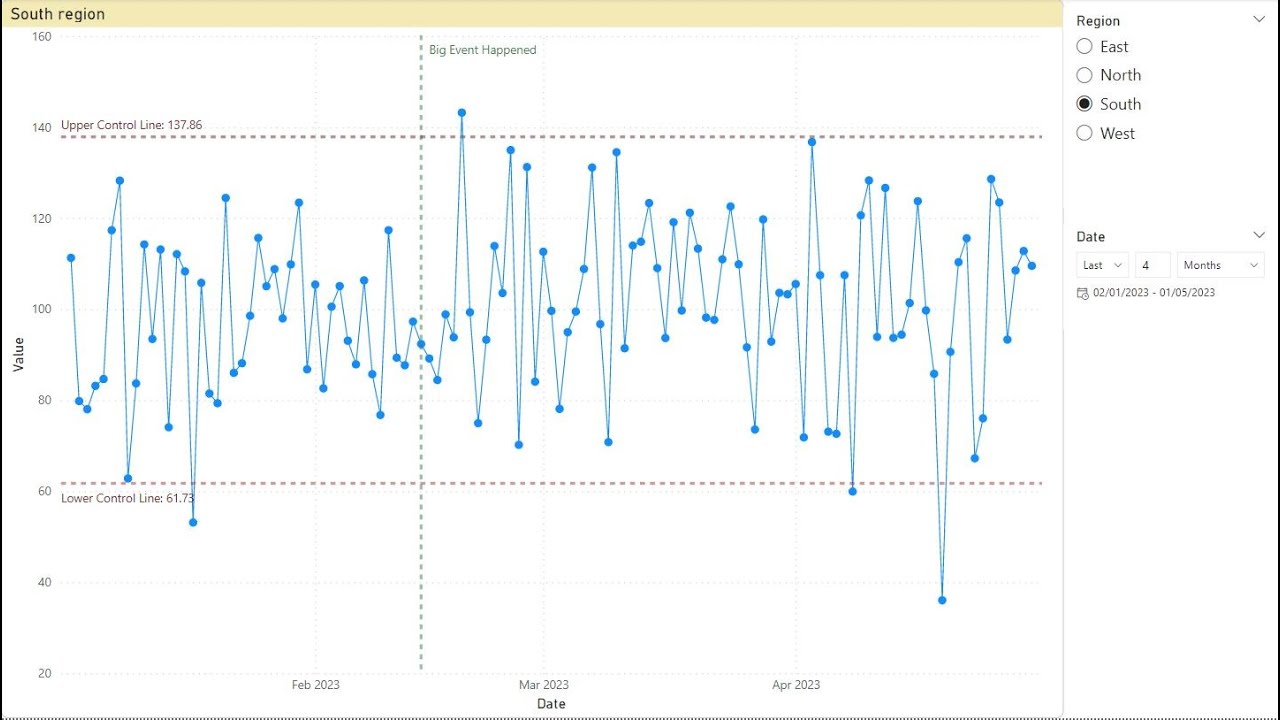
Chris Barber examines a famous visualisation by the Wall Street Journal (http://graphics.wsj.com/infectious-di...) and comes up with an alternative approach in Power BI. Chris explains about multiple fact tables, using a junk dimension and creating dynamic confidence intervals. This is an intermediate level of Power BI covering the M language, data modelling and DAX.
Files can be downloaded from https://tinyurl.com/y5t9ln2n
We run a full range of data analysis and generative AI courses in London and online. See our courses at zomalex.co.uk
Не удается загрузить Youtube-плеер. Проверьте блокировку Youtube в вашей сети.
Повторяем попытку...
Повторяем попытку...

Доступные форматы для скачивания:
Скачать видео
-
Информация по загрузке: