Ditch the Text Walls, Embrace the White Space!
Автор: Evaluation Transformation
Загружено: 2024-01-08
Просмотров: 217
Описание:
Tired of your reports looking like dense, unreadable brick walls? Chris from Data Viz Made Easy is here to show you a simple trick that will make your reports professional, visually appealing, and easier to digest: using white space effectively.
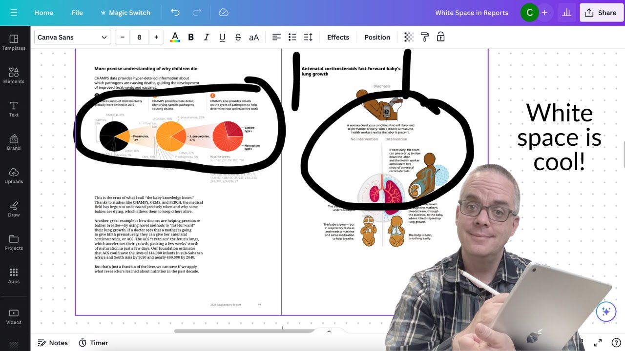
Forget side-to-side text blocks! Chris compares two reports: one status quo data report and a clean, airy annual report. He highlights the power of deliberate white space:
Create a magazine-like feel: White space makes your report look professional and polished, like a top-notch magazine.
Reduce overwhelm: Dense text blocks are intimidating. White space gives your readers breathing room, making your report more inviting and easier to read.
Highlight key elements: Charts, images, and headlines stand out when surrounded by white space, drawing attention to important information.
How to achieve white space magic?
Grids are your friend: Use a grid system to organize your content and ensure consistent spacing. Canva's grid tool is a great example.
Discipline is key: Be strict about keeping text within the grid and avoid filling up the white space.
Get creative: Explore different grid layouts, like two-column or four-column grids, to find what works best for your content.
Remember: White space is not wasted space. It's a powerful design tool that can make your reports more effective and engaging.
Subscribe to Data Viz Made Easy and for more data visualization tips, visit Chris's website at freshspectrum.com.
Looking to improve your data visualization and reporting skills?
View Upcoming Workshops: https://datavizmadeeasy.com
Повторяем попытку...
Доступные форматы для скачивания:
Скачать видео
-
Информация по загрузке:


