Скачать
How to create an annotated column chart with Excel and Canva
Автор: Evaluation Transformation
Загружено: 2024-06-20
Просмотров: 1052
Описание:
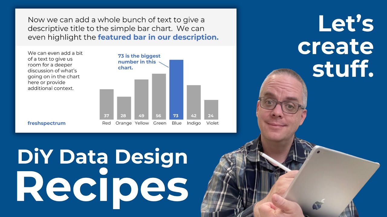
In this video I'll show you step by step how to create a simple infographic. We start with a column chart in Excel (a.k.a. bar graph or bar chart) and then bring it into Canva for annotations.
This is part of the DiY Data Design recipes series.
***
Looking to improve your data visualization and reporting skills?
Download free resources (eBooks, worksheets, courses, and comics) at https://freshspectrum.com/library
Не удается загрузить Youtube-плеер. Проверьте блокировку Youtube в вашей сети.
Повторяем попытку...
Повторяем попытку...
Доступные форматы для скачивания:
Скачать видео
-
Информация по загрузке:


