Pepsi Logo History
Автор: The Brand Storyline
Загружено: 2026-02-05
Просмотров: 791
Описание:
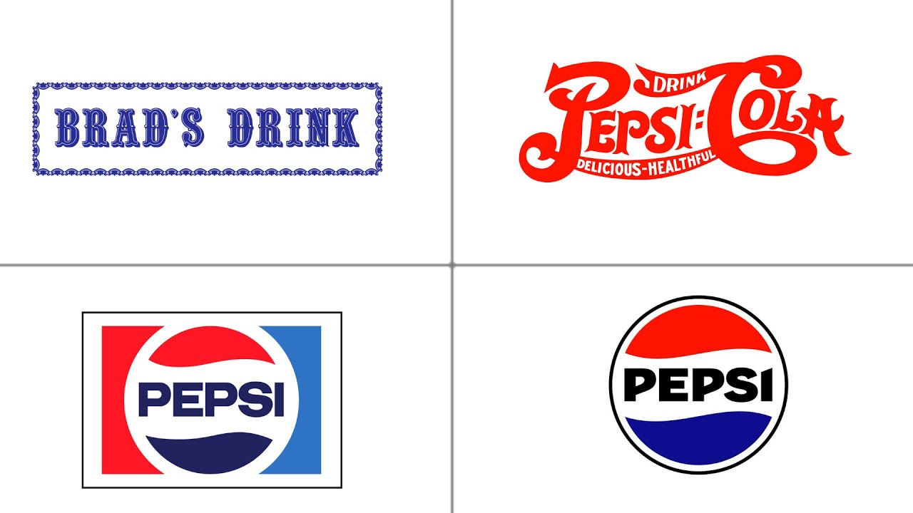
Pepsi is one of the most recognizable brands in the world, and its logo evolution tells a story of constant reinvention. Unlike brands that rely on consistency alone, Pepsi has repeatedly reshaped its visual identity to stay aligned with culture, youth, and changing design trends.
In this episode of The Brand Storyline, we explore how Pepsi’s logo evolved from ornate, script-based designs into one of the most minimal and symbolic logos in modern branding. Each redesign reflects its era—from patriotic influences and retro typography to sleek geometry and digital-first simplicity.
We examine how color, shape, and proportion became central to Pepsi’s identity, especially the iconic red, white, and blue globe. Subtle adjustments to balance, curvature, and spacing helped the logo feel energetic, modern, and adaptable across packaging, advertising, and global markets.
This breakdown highlights how Pepsi uses bold change as a strategy—embracing risk, cultural relevance, and visual experimentation while remaining instantly recognizable.
👉 Watch till the end for a closer look at the modern Pepsi logo and why simplicity, when paired with strong symbolism, can outperform tradition.
Subscribe to The Brand Storyline for more logo evolutions, brand stories, and design analysis.
#Pepsi
#PepsiLogo
#LogoEvolution
#BrandStoryline
#BrandIdentity
#LogoDesign
#DesignHistory
#VisualBranding
#BrandEvolution
Повторяем попытку...
Доступные форматы для скачивания:
Скачать видео
-
Информация по загрузке:


![Wonderland.jar [Episode 21] - The Maze](https://imager.clipsaver.ru/Zk8P05gLdJw/max.jpg)