Nintendo Logo History Explained
Автор: The Brand Storyline
Загружено: 2026-02-07
Просмотров: 323
Описание:
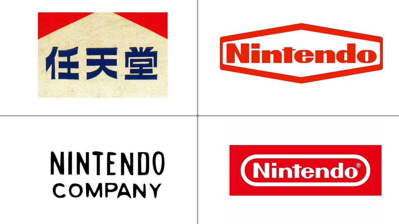
In this episode of The Brand Storyline, we explore how Nintendo’s logo evolved from early decorative wordmarks into the iconic rounded rectangle design recognized worldwide. Each iteration reinforced approachability, fun, and reliability.
This breakdown highlights how restraint became Nintendo’s greatest strength. Clean typography, balanced proportions, and minimal color allowed the logo to adapt seamlessly across consoles, games, and digital platforms.
👉 Watch till the end to see why Nintendo’s logo proves that simplicity, when paired with strong brand values, can last for decades.
Subscribe to The Brand Storyline for more logo evolutions, brand stories, and visual identity breakdowns.
#Nintendo
#NintendoLogo
#LogoEvolution
#BrandStoryline
#BrandIdentity
#LogoDesign
#GamingBrand
#DesignHistory
#VisualBranding
Повторяем попытку...
Доступные форматы для скачивания:
Скачать видео
-
Информация по загрузке: