Why Game UI Breaks So Easily (What I Learned Designing It)
Автор: Jinni
Загружено: 2026-02-12
Просмотров: 962
Описание:
🔗 COMMUNITY LINKS
Discord: / discord
Instagram: / therealjinni
Future streams: / therealjinni
----
This video is a reflection on what I learned while designing game UI, specifically health bars, stamina bars, cooldowns, and icons.
I don't feel entitled to teach since I think that I still have much to learn, so this is not a course, tutorial, or guide. This is a personal breakdown of what surprised me, what was harder than expected, and the design decisions that didn’t work the way I initially thought they would.
I now focus on approaching UI from a functional point of view first, thinking about how each element would actually be used in-game, and then iterating toward something that still felt visually interesting. That shift in thinking ended up changing how I approached every UI element after the first one.
If you’re also learning game development, pixel art, or UI design, maybe some of these struggles or observations help you think differently about how you approach usability versus style.
This video is part of an ongoing series where I document what I’m learning as I go.
---
⏱️ CHAPTERS / TIMESTAMPS
00:00 – Why I wanted to talk about game UI
01:05 – What I’ve been working on (health, stamina, cooldowns)
03:30 – Why UI design feels different from character animation
06:10 – Function vs appearance in UI design
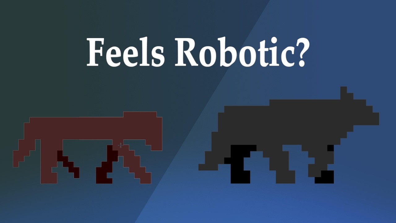
09:00 – Health bar design mistakes I ran into
12:45 – Readability problems at low health values
16:30 – Designing stamina and cooldowns with usage in mind
19:40 – When UI becomes too distracting
23:10 – Balancing style and usability
26:10 – Why iteration matters so much in UI
28:20 – What I’m focusing on next (VFX)
---
🧪 WORK / PORTFOLIO
My work & experiments:
https://insidethelamp.itch.io
Повторяем попытку...

Доступные форматы для скачивания:
Скачать видео
-
Информация по загрузке:


![ПОСМОТРЕЛ ВСЕ СЕЗОНЫ КУХНИ И ПОЖАЛЕЛ [Сериало-Мыло]](https://imager.clipsaver.ru/8C9lmngbBgo/max.jpg)