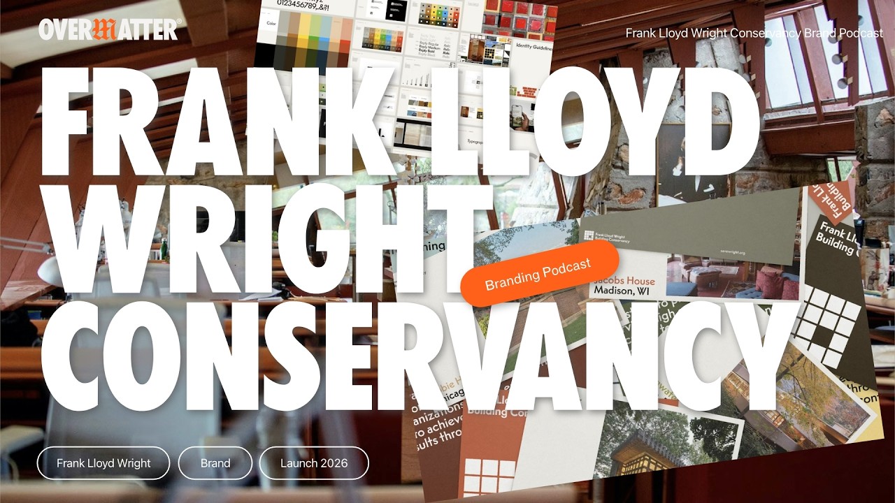
Frank Lloyd Wright Foundation Building Conservancy Rebrand - When the Logo Should Disappear
Автор: Overmatter
Загружено: 2026-02-08
Просмотров: 25
Описание:
The Frank Lloyd Wright Foundation Building Conservancy rebrand just unveiled a new brand identity—and the most interesting thing about it? The logo is designed to get out of the way, we think. In this episode, I sit down with Miles Seiden to unpack a rebrand that challenges everything we think we know about brand presence.
In this episode of Brand Design Critique, we dive into the Frank Lloyd Wright Foundation Building Conservancy rebrand:
→ Why a "disappearing" logo might be the smartest brand move
→ When grid systems need to bend, break, and reflect
→ The tension between anonymity and identity in heritage brands
→ What muted color palettes and retro type specimens tell us about honoring legacy
→ Why some brands prioritize their content over the identity itself
From art deco-inspired type to muted colors and a questionable logo, this rebrand proves that sometimes the best brand design is the one that knows when to step back. We even change our minds throughout the conversation—because that's what good critique should do.
Whether you're a designer, brand strategist, or architecture enthusiast, this conversation explores how identity can serve legacy without overpowering it.
Subscribe for more brand reviews, design critiques, and honest conversations about what makes visual identity work.
Drop a comment with your take on anonymous branding.
And if you prefer to read, check out the full article here: www.overmatter.design/blog/the-frank-lloyd-wright-building-conservancy-rebrand-when-anonymous-design-is-best
Connect with Kaleb:
LinkedIn: / kaleb-dean
Instagram: / overmatter.design
Повторяем попытку...
Доступные форматы для скачивания:
Скачать видео
-
Информация по загрузке:


![[FULL EPISODE] America ByDesign: Season 3 | Episode 8](https://imager.clipsaver.ru/SevSrM4Fmis/max.jpg)