How Edward Hopper Painted Darkness: 'Nighthawks' Color Study and Palette
Автор: Great Artists Steal
Загружено: 2020-02-13
Просмотров: 4729
Описание:
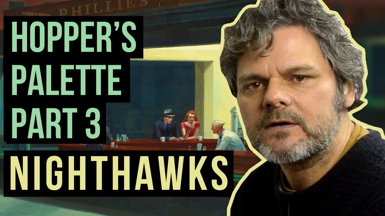
'Nighthawks' is possibly Edward Hopper's best known painting. Tremendously atmospheric, it shows a semi-deserted restaurant in an sleeping city, with artificial light and shadow slicing through the scene. But how exactly did Hopper paint the darkness that has such an affect on the viewer?
In this video I recreate the colors that Hopper mixed for 'Nighthawks' and use them to create a Color Study that shows you how they combine together. In doing so I believe I find further evidence that Edward Hopper used the two-color mixing method. A few key color combinations appear time and again within the painting. I show you how these color combinations hold the painting together and create the both sharp and subtle contrasts upon which this work depends.
We will also see how tiny bits of brighter color in exactly the right place enhance the sense of light and dark, and bring the painting to life. We also see how Hopper uses the 'lost edge' technique to stop the figuration in the drawing becoming too cartoon-like. As always, there is a lot to steal from this Great Artist!
Key color mixing combinations include:
cadmium yellow and ultramarine blue
emerald green and burnt sienna
emerald green and vermilion
cadmium yellow and emerald green
alizarin crimson and yellow ocher
prussian blue and vermilion
Hopper uses these combinations to create a vast range of colors - so many that I run out of brushes! - and in the next video I will take the Color Study to completion.
The original of the work is held by the Art Institute of Chicago: https://www.artic.edu/artworks/111628...
Повторяем попытку...
Доступные форматы для скачивания:
Скачать видео
-
Информация по загрузке:


