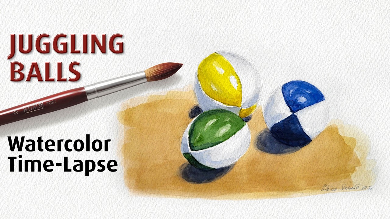
How Many Colors Do You Really Need for Watercolor? Watercolor Painting Course for Beginners #8
Автор: Watercolor Painting by Lubica Vesela 🎨
Загружено: 2026-03-01
Просмотров: 15
Описание:
How many watercolor paints do you truly need to create vibrant, expressive artwork? Forget about overwhelming, expensive sets—the secret to success lies in choosing the right pigments. In this lesson, we explore a simple and practical approach to building your palette, starting with just three primaries and gradually expanding to a carefully chosen selection of 6 to 12 colors. Whether you are a beginner or looking to refine your setup, you’ll learn how to mix natural darks without black, understand the difference between pans and tubes, and discover why a limited palette is actually the key to mastering color mixing and saving money.
00:25 Mixing Primaries. Master the art of creating a full spectrum using only three essential colors.
01:20 Mixing Darks. Ditch flat black and learn to mix deep, natural shadows with ultramarine and burnt sienna.
01:54 Sets vs. Individual Colors. Prioritize professional-grade quality over massive, cheap sets to keep your mixes clean and vibrant.
02:48 Pans vs. Tubes. Choose between the compact convenience of pans or the raw power of concentrated tubes.
03:13 Pros – Cons. Weigh the benefits of portability and low waste against the speed and intensity of liquid pigment.
03:31 Demo. See these principles in action through a practical demonstration of color mixing and application.
How many watercolor paints do you truly need to create vibrant, expressive artwork? In this lesson, we explore a simple and practical approach to building your watercolor palette—starting with just three primary colors and gradually expanding to a carefully chosen selection of six to twelve high-quality paints.
You’ll learn how to mix a wide range of hues using the traditional primaries (red, yellow, and blue), and why this limited setup is more powerful than it may seem. We’ll also discuss when and why it makes sense to add convenience colors such as orange, green, violet, turquoise, ultramarine, and burnt sienna—especially for cleaner mixes and stronger contrast.
This lesson also covers:
▶️ How to mix rich, natural-looking darks without using pure black
▶️ Why ultramarine and burnt sienna create beautiful shadow neutrals
▶️ The difference between student-grade sets and professional-quality paints
▶️ Why smaller, high-quality palettes outperform large, overwhelming sets
▶️ The practical pros and cons of pans vs. tubes
▶️ How many colors are realistically enough for almost any subject
Whether you are just starting your watercolor journey or refining your setup, this lesson will help you choose your paints wisely and avoid unnecessary expenses. A limited palette encourages better color understanding, cleaner mixing, and more confident painting.
If you enjoy learning watercolor in a structured, practical way, make sure to subscribe so you don’t miss the next lesson in the course.
✍️ AUTHENTICITY & TOOLS
The content of this video is based on my personal experience, study, and practice.
Originally created in Slovak, the script was translated into English using Google Gemini, and the voiceover was generated with ElevenLabs.
#watercolor #painting #art
Lubica Vesela | Watercolor Art
Повторяем попытку...

Доступные форматы для скачивания:
Скачать видео
-
Информация по загрузке: