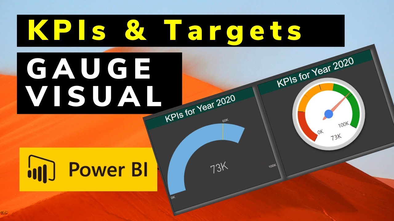
Power BI Gauge Chart with Dynamic Colors
Автор: Vali Mammadov
Загружено: 2025-06-09
Просмотров: 941
Описание:
/ vali-mammadov-powerbi-developer
💡 Learn how to create a dynamic color Gauge Chart in Power BI!
In this short tutorial, I’ll show you how to apply conditional formatting to your gauge chart so it changes color based on performance values. This is a great way to make your dashboards more engaging and informative.
📊 Whether you’re tracking sales, targets, or KPIs — dynamic visuals like this one help you tell better stories with data.
🔧 Tools used: Power BI, DAX, and formatting techniques
📅 Example shown with months and target values
📈 Suitable for beginners and intermediate Power BI users
👉 Subscribe for more Power BI tips and visuals!
#PowerBI #DataViz #GaugeChart #DAX #Dashboard
Повторяем попытку...

Доступные форматы для скачивания:
Скачать видео
-
Информация по загрузке:


![Почему работает теория шести рукопожатий? [Veritasium]](https://imager.clipsaver.ru/ggI1xKzoANs/max.jpg)

