Advancing with Watercolor: “Skies” Venice Silver Skies - Tonal Study
Автор: Gary Tucker
Загружено: 2025-10-04
Просмотров: 1242
Описание:
Silver Skies - Tonal Study
About the Author
Gary Tucker is a watercolor artist/ instructor living in the Boston area. He offers online workshops , in person workshops, and an extensive catalogue of Free watercolor videos on technique and design on
Youtube at / garytuckerartist
My on-line store https://www.gumroad.com/garytuckerartist
My web site https://www.garytuckerartist.com
instagram page / garytuckerartist
Free PDF https://userfiles.faso.us/98794/26253...
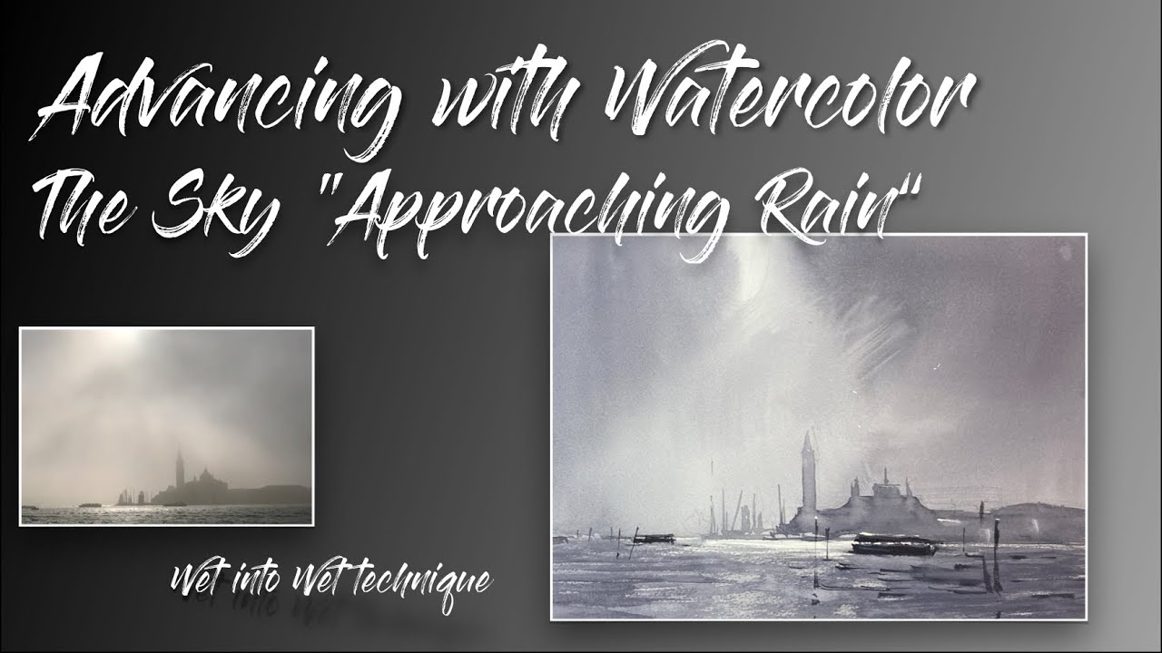
THE VALUE OF THE STUDY
I often proceed a new subject with a tonal study - focusing on the arrangements of
lights and darks of my subject. Very often as in todays subject the image is reduced to 2
or 3 distinct values. So this alone helps to simplify the complexity in front of me. I also
use the tonal study to play with the design. For example I added a Vaporetto to the
foreground, some channel markers, and a few birds to the painting to see if I liked the
way that it look. The study also gives me a chance to warm up - to stretch as it were
which is an important part of the sequence for me in doing a watercolor
THE DESIGN
The design process began when I snapped the photo and framed the iconic San
Giorgio Maggiore in Venice. I wanted to catch the moment of the parting mist, to catch
the spotlight and the proximity ot the icon. Beyond this I played with several things in
this study to arrrive at a better image
1 - Iplaced the center of interest off- center to create imbalance with equals tension
in painting.
2 - I staggered the Vaporetti in the painting to create more interest and depth. This
is most noticeable in the near boat which interesects the buildings and horizon at key
moments and pushes them into the distance
TONAL STRUCTURE
The tonal structure is based again on a mid tone with some dark shapes and a
smaller number of light shapes. This ration is important because it avoids equal
measures which can make a painting static.
I used over lapping darke shapes to create a weight to the atmosphere. Fading off
the tower of San Giorgio is telling us that there is a heavy mist between the tower and
us. Placing a darker vaporetto between us and the tower also creates the feeling of mist
and depth
MISFIRES
In this sort of study I also learn what to do differently or avoid all together.
In this painting I decided to forgo the large flat except while blending.
learned to start the grouping of the buildings along the bottom first and then
extend the shape to the tower last
I switched to the mop nad it was a better choice for the sky - I learned also that I
need to mix up color beforehand to ensure comfortable painting
Повторяем попытку...
Доступные форматы для скачивания:
Скачать видео
-
Информация по загрузке:


