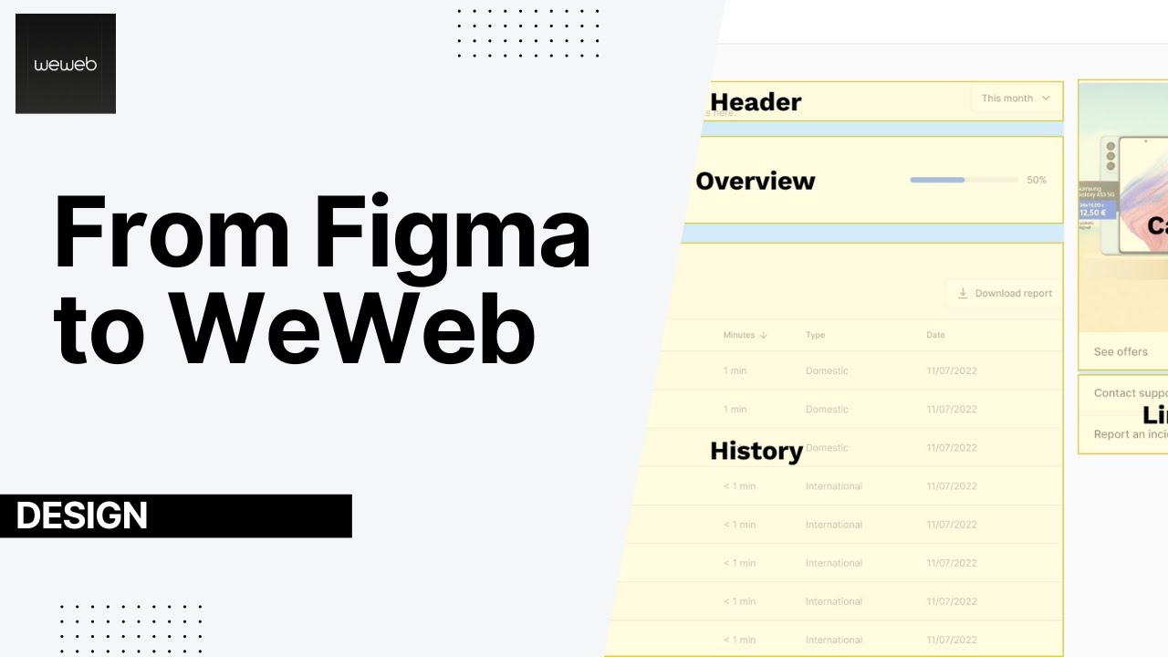
Responsive design in WeWeb
Автор: WeWeb
Загружено: 2023-12-27
Просмотров: 3950
Описание:
🚀 Learn how to design responsively in WeWeb by adapting layouts for tablet and mobile, from adjusting text sizes to switching flex directions.
What You’ll Learn
✅ WeWeb’s desktop-first approach explained
✅ How changes cascade across breakpoints
✅ When to use custom styles per device
✅ Hide elements on specific screen sizes with display: off
✅ Adjust margins, padding, and layout direction
✅ Optimize image rendering for responsiveness
✅ Fix common mobile layout and spacing issues
Resources
✨ WeWeb → https://www.weweb.io
❤️ Join the Community → https://community.weweb.io
Chapters
00:00 Introduction
00:10 Desktop-First Styling in WeWeb
01:00 Managing Text Sizes Across Devices
02:15 Using Visual Cues for Custom Styles
03:10 Display vs Rendered Elements
04:30 Hiding Elements on Mobile
05:30 Adjusting Columns for Tablet Layout
06:30 Optimizing Images for Responsiveness
08:00 Cleaning Up Tablet Padding & Spacing
09:59 Designing for Mobile
11:00 Fixing Layouts in Header and Overview
12:15 Making the Table Truly Mobile-Friendly
14:00 Final Mobile Tweaks
15:43 4 Key Tips for Responsive Design
17:02 Wrap-Up & Encouragement to Experiment
#nocode #ai #weweb #nocodedevelopment #saas #uiux #uidesign #uxdesign #uidesigntutorial #aiwebdevelopment #tutorials #frontend #frontenddevelopment #frontenddeveloper #programming #backend #fullstack #fullstackdeveloper #fullstackwebdevelopment #webdevelopmentresources #aicoding #nocodeai #vibecoding
Повторяем попытку...

Доступные форматы для скачивания:
Скачать видео
-
Информация по загрузке: