Скачать
Mapping the World's Immigration Flows, Country-by-Country
Автор: Metrocosm
Загружено: 2016-06-30
Просмотров: 215686
Описание:
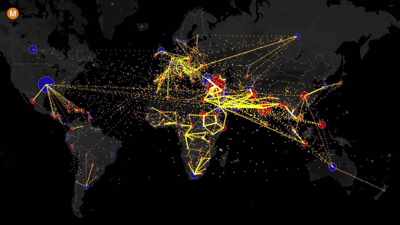
This map shows net migration (inflows minus outflows) by country of origin and country of residence between 2010 and 2015.
Blue circles = positive net migration (more inflows). Red circles = negative net migration (more outflows). Each yellow dot represents 1,000 people.
For the full interactive version of the map and more information about data sources, see: http://metrocosm.com/global-immigrati...
Не удается загрузить Youtube-плеер. Проверьте блокировку Youtube в вашей сети.
Повторяем попытку...
Повторяем попытку...
Доступные форматы для скачивания:
Скачать видео
-
Информация по загрузке: