Color Charts For Artists With Oil Paint
Автор: Rachel Dowd Fine Art
Загружено: 2025-03-14
Просмотров: 310
Описание:
A color chart is a visual tool that maps out how colors interact—think of it as a reference grid. It helps you:
See how your specific paints mix.
Identify the range of hues, tints, shades, and tones you can achieve.
Plan your artwork by picking harmonious or contrasting colors.
Avoid muddy mixes by testing combinations beforehand.
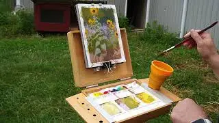
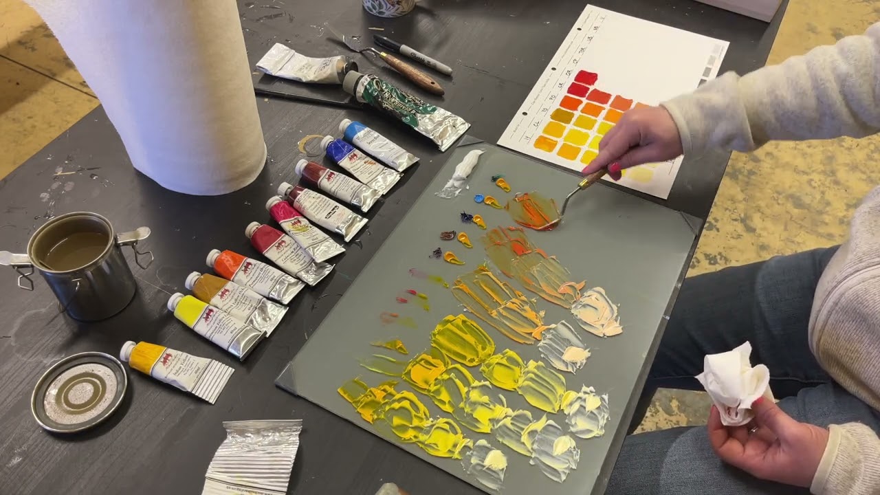
I've been diving into Richard Schmid's "Alla Prima" book and recently watched one of his recorded demos, which opened my eyes to the power of color charts for mastering color harmony. I’m excited to share a quick video of how I’m tackling them now. Years ago, I tried making these charts, but I didn’t fully grasp how to create or use them effectively, so they ended up gathering dust. This time, to save effort and ensure accuracy, I decided to invest in pre-made charts from ColorFrontier.com. They’re designed to match the specifications Richard Schmid uses, which feels like a perfect starting point for getting this right.
Here are the 11 colors I'm using along with the brands:
Cadmium Lemon (Michael Harding)
Indian Yellow (Michael Harding)
French Yellow Ochre (Michael Harding)
Permanent Orange (Michael Harding)
Cadmium Red (Michael Harding)
Quinacridone Rose (Michael Harding)
Caesar Purple (Schmincke)
Transparent Oxide Red (Michael Harding)
Ultramarine Blue (Michael Harding)
Sevres Blue (Williamsburg)
Viridian (Rembrandt)
Titanium White (Gamblin)
Explore my Patreon page to access full-length oil and gouache painting demonstrations, where I guide you through my creative process with detailed explanations as I paint: patreon.com/RachelDowdFineArt
Повторяем попытку...
Доступные форматы для скачивания:
Скачать видео
-
Информация по загрузке: