How to Make Your Website Mobile Responsive in WordPress & Elementor (2026)
Автор: MrGreenWeb
Загружено: 2026-02-16
Просмотров: 94
Описание:
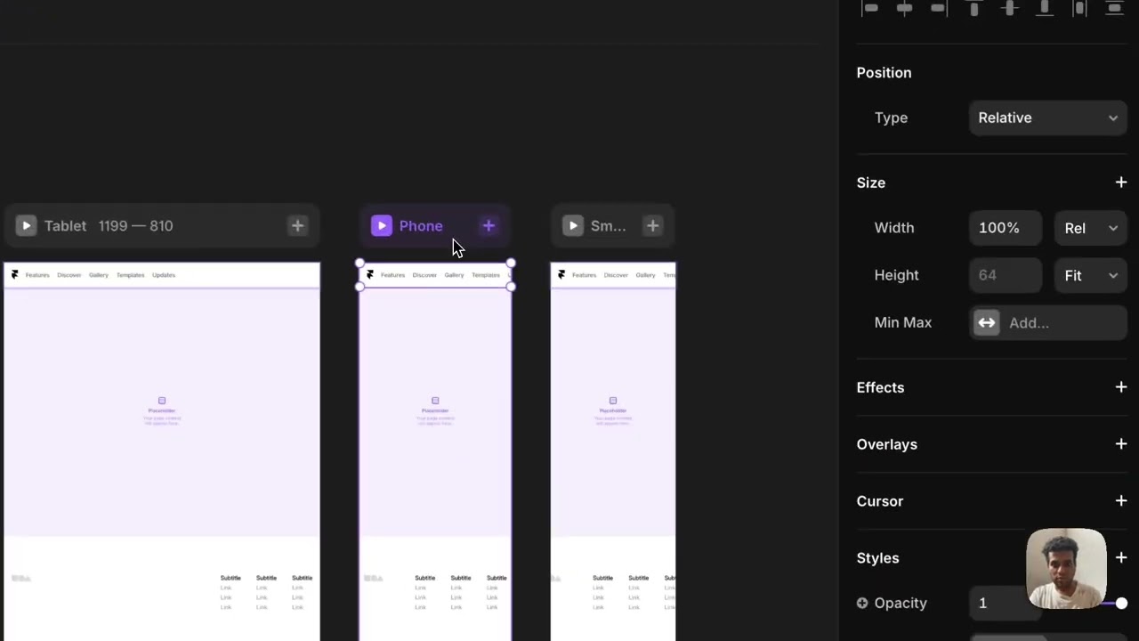
Is your website not looking good on mobile? In this step-by-step 2026 tutorial, I’ll show you how to make your website mobile responsive in WordPress and Elementor - the right way.
Many beginners struggle with fixing mobile layout issues, spacing problems, font sizes, and broken sections. In this video, you’ll learn how to properly adjust your website for mobile devices using Elementor’s responsive settings.
This tutorial is beginner-friendly and works for any WordPress website built with Elementor
🔥 What You’ll Learn
✅ How to switch between desktop, tablet & mobile view
✅ How to fix spacing and margin issues
✅ How to adjust font sizes for mobile
✅ How to hide sections on mobile
✅ How to fix overlapping elements
✅ How to optimize mobile responsiveness properly
🎯 Who This Is For
WordPress beginners
Elementor users
Web designers
Freelancers fixing client websites
📢Useful Resources
📌 Best Hosting for WordPress: (https://ultahost.com/#mrgreenweb)
📌 Premium WordPress Themes & Plugins on Envato Elements: [https://1.envato.market/Dy6meo]
(affiliate disclosure: these are affiliate links — if you purchase through them, I may earn a small commission at no extra cost to you)
📌Download Elementor Pro from here: https://selar.com/f71387rwxp
👉 Subscribe for more WordPress & Elementor tutorials
Повторяем попытку...

Доступные форматы для скачивания:
Скачать видео
-
Информация по загрузке:


![How to Scrape THOUSANDS of Apollo Leads in SECONDS [2026 TUTORIAL]](https://imager.clipsaver.ru/p4fKqBAj_Z8/max.jpg)

