Club (re)branding - Why logos change | FootyEurope
Автор: Matthijs
Загружено: 2021-04-10
Просмотров: 312
Описание:
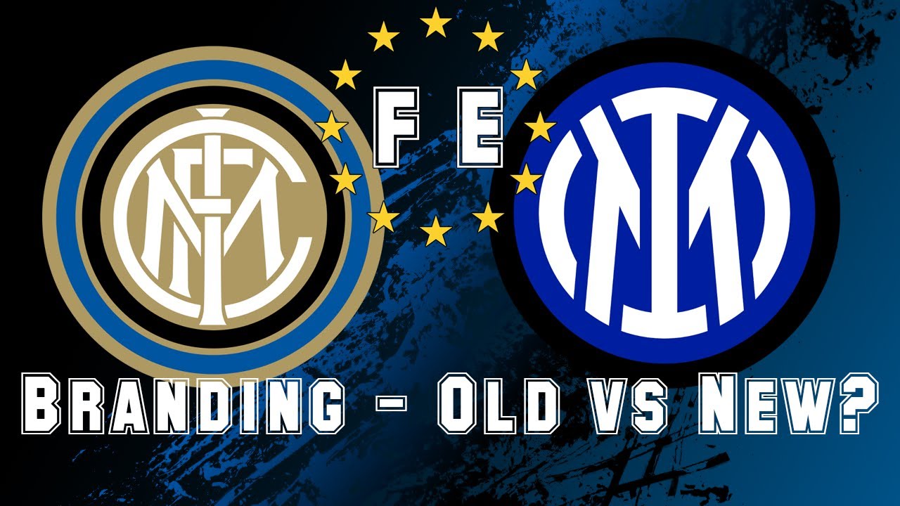
The recent Inter Milan logo change made me wonder. Why do clubs feel the need to change their logo, when the existing one wasn’t ‘broken’?
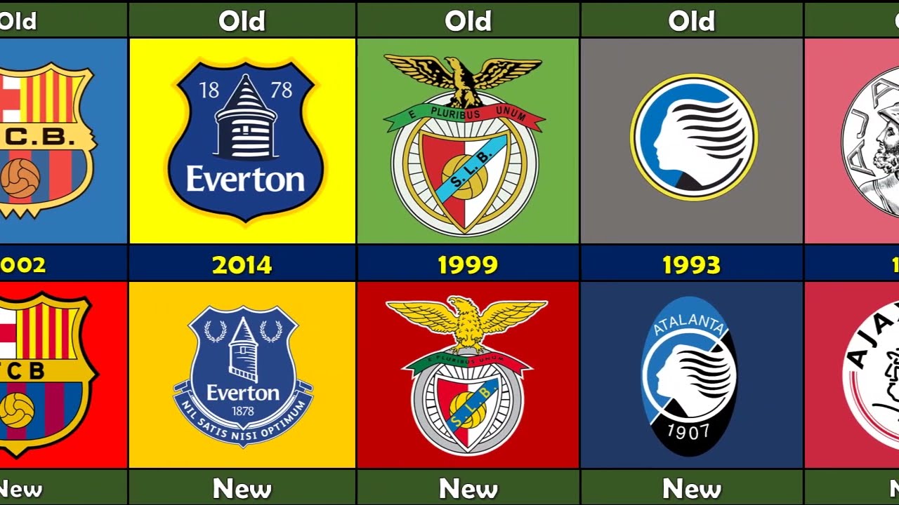
Recently a trend has been visible. Clubs changing their logos to more ‘modern’ logos. But why is this the case? What is the driving force behind these changes? And what are some other recent examples of logo changes. The bad and the good ones included.
The Inter Milan logo is one of the most recognizable football logos in the world. From India to Mexico. Every football fan would be able to tell what club it is. So the question for me is. Why fix something that is clearly not broken. But before we het into why clubs change their branding, let’s look at some recent logo changes. A before and after comparison. I will give each logo an individual rating.
Thank you for watching this video. I hope to be releasing more in depth football stories about players, clubs, derbies and fans in the near future.
Please consider subscribing if you liked this content and it would be much appreciated if you’d give this video a like.
I hope to see you in the next one.
Повторяем попытку...
Доступные форматы для скачивания:
Скачать видео
-
Информация по загрузке: