Create Custom Column Chart to display Years, months, YTD in Power BI | MiTutorials
Автор: MITutorials
Загружено: 2023-10-30
Просмотров: 11240
Описание:
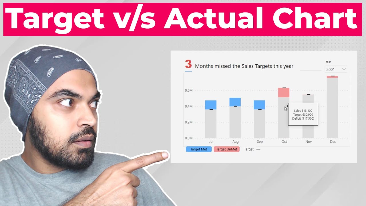
Welcome to another Power BI tutorial! In this video, we'll show you an awesome hack to enhance your data visualization skills. We'll guide you through the process of creating a dynamic and informative column chart that displays sales data for previous years, the same period last year, and year-to-date (YTD). We'll also make use of a slicer to select year for a comprehensive analysis.
Whether you're a beginner or an experienced Power BI user, this tutorial is designed to help you level up your reporting and analytics game. We'll provide step-by-step instructions and valuable tips to make the process smooth and easy to understand.
Key Topics Covered:
Setting up your data model for time-based analysis
Calculating previous year sales
Calculating same period last year sales
Calculating year-to-date (YTD) sales
Building an interactive column chart
Customizing visuals for a polished look
For Queries ✉ : [email protected]
Повторяем попытку...

Доступные форматы для скачивания:
Скачать видео
-
Информация по загрузке: