This tiny design flaw ruins Apple TV’s new interface
Автор: Brom Sulaiman
Загружено: 2025-08-02
Просмотров: 765
Описание:
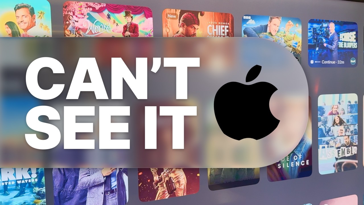
Apple’s new Liquid Glass UI looks stunning, but there’s a serious UX flaw hiding in plain sight.
While trying to watch something on Apple TV, I realised my partner literally couldn’t tell which show I had selected, because the visual cue was so subtle, it was invisible from across the room.
In this video, I break down what went wrong with Apple’s new tvOS interface, why it’s a classic UX mistake, and how I’d fix it using simple design principles and quick Figma prototypes. Then, I test those solutions with a real user: the person who had the problem in the first place.
💡 This is a real-world example of how product teams can miss small, critical usability issues and why user feedback is gold dust.
#UXDesign #AppleTV #ProductDesign #Figma #DesignThinking #RealUX #Usability #LiquidGlassUI #AppleUI #DesignFails #buildinpublic
Subscribe for more design tips: / @bromsulaiman
Повторяем попытку...
Доступные форматы для скачивания:
Скачать видео
-
Информация по загрузке: