Fixing a Failed Logo: PowerRock Redesign
Автор: Prakash Verma
Загружено: 2025-12-09
Просмотров: 1389
Описание:
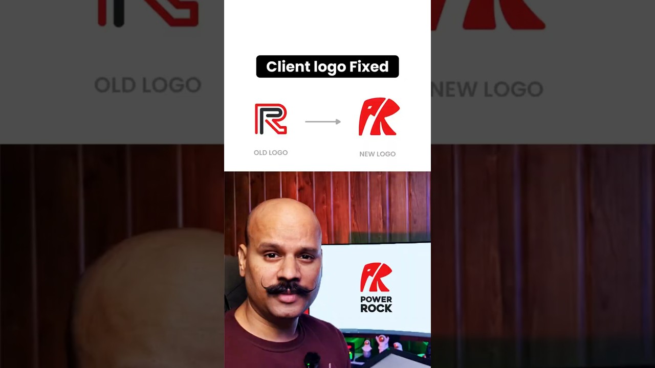
The client’s old PowerRock logo failed because it had no meaning, no relevance, and no identity.
So I redesigned it using a strong, meaningful concept.
Here’s why the new logo works:
🐘 The P forms the elephant’s head + trunk
🐘 The R shapes the ear + front legs
Together they create an abstract elephant, the perfect symbol for:
✔ Strength
✔ Durability
✔ Stability
✔ Memory
✔ A bond that never breaks
The logo now tells a story that aligns with the product —
an adhesive brand built on elephant-level strength.
#logodesign #logo #branding #brandidentity #logoredesign #graphicdesign #shorts #ytshorts #designerlife #powerrock #adhesivebrand #brandstory #elephantlogo #minimaldesign #creativeprocess
Повторяем попытку...
Доступные форматы для скачивания:
Скачать видео
-
Информация по загрузке:


![Шансы и вероятности в сапёре: 8, 77, 8-8, поля без 0, 1, 2, в одно нажатие. [Games Computer Play]](https://image.4k-video.ru/id-video/uHAREopJlW4)
