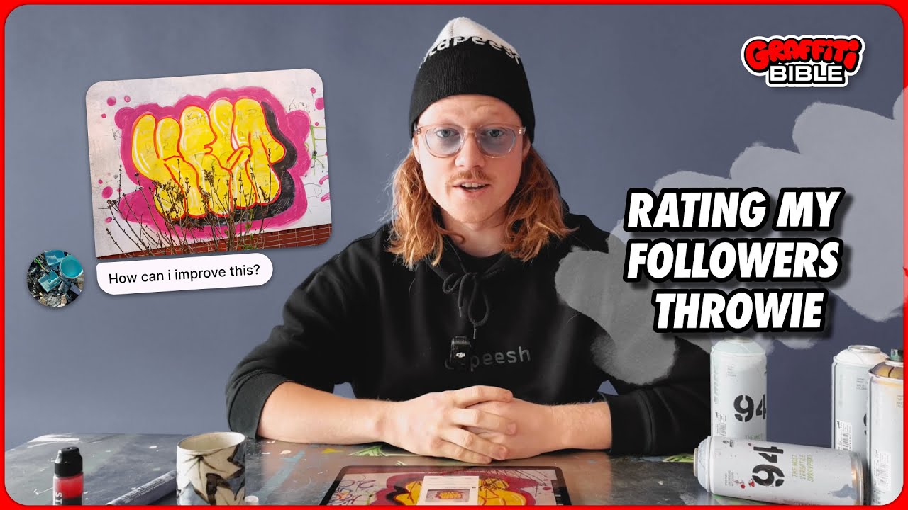
RATING MY FOLLOWER'S GRAFFITI THROWIE 🥵
Автор: GraffitiBible
Загружено: 2025-04-26
Просмотров: 623
Описание:
In this video, I’m sharing essential tips to improve your throw-up graffiti skills, using ado_pok's piece as an example! Whether you’re just starting out or looking to refine your technique, these tips will help you take your throw-ups to the next level!
👉 Graffiti Throw-Up Tips You’ll Learn:
Letter Spacing: Why spacing your letters correctly makes your throw-up easier to read and look cleaner.
Balance & Consistency: How to make sure the top and bottom of your throw-up are in harmony.
Avoiding Overlapping: Don’t hide key parts of the letters! Learn how to keep your throw-up legible.
Add-Ons for Extra Style: How to use drips, splats, and arrows to elevate your design. 🔥
Color Schemes & Clean Outlines: Learn how to choose colors that pop and keep your outline sharp for a professional look.
These tips will help you get the perfect round and balanced throw-up, and make sure your style stands out on the streets! Whether you're using spray cans or digital tools, the principles in this video will apply to all forms of graffiti.
Want the brushes I used in this video? Check out our brush pack https://www.etsy.com/dk-en/listing/14...
Comment below with your thoughts, feedback, or any tips of your own! Let's keep the conversation going and share knowledge in this safe space for graffiti artists. 🔥
If you found these tips helpful, LIKE, SUBSCRIBE, and turn on the BELL ICON to get notified about more graffiti tutorials and tips!
#GraffitiTips #ThrowUpGraffiti #StreetArtTips #GraffitiTutorial #CanControl #GraffitiArt #UrbanArt #GraffitiAddons #StreetArtCommunity
Повторяем попытку...
Доступные форматы для скачивания:
Скачать видео
-
Информация по загрузке:


