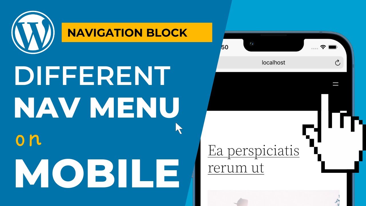
Use a different MENU on MOBILE with the Navigation block in WORDPRESS block editor
Автор: Dave on WP
Загружено: 2022-01-28
Просмотров: 25911
Описание:
🔔🔔🔔🔔 UPDATE: NEW RESPONSIVE NAVIGATION MENU PLUGIN 🔔🔔🔔🔔
• Pro RESPONSIVE MOBILE MENU SECRET you need...
https://wordpress.org/plugins/getdave...
There's now no need to implement this technique yourself. Just download the above Plugin and activate on your site and you will have two new blocks available for:
Mobile Navigation
Desktop Navigation
---------------------
I show you how you can display a different menu on "mobile" than you on "desktop" using the Navigation block in WordPress 5.9 full site editing.
This requires some CSS which I have left below:
/* CUSTOM RULES */
@media ( min-width: 782px ) {
.wp-block-navigation.nav-primary--mobile {
display: none;
}
}
@media ( max-width: 781px ) {
.wp-block-navigation.nav-primary--desktop {
display: none;
}
}
Issue - https://github.com/WordPress/gutenber...
What is CSS? - https://developer.mozilla.org/en-US/d...
Theme Stylesheet in WordPress - https://developer.wordpress.org/theme...
Повторяем попытку...
Доступные форматы для скачивания:
Скачать видео
-
Информация по загрузке:


![Creating a website with Gutenberg FSE, WordPress 6.7, Twenty Twenty-Five Theme [LIVE!]](https://ricktube.ru/thumbnail/dcEcpmCn88I/mqdefault.jpg)


