How to Customize Donut Chart
Автор: MokkupAI
Загружено: 2024-10-21
Просмотров: 48
Описание:
A donut chart is a variation of a pie chart, with the center of the pie removed. This makes it a good choice when someone want to focus on the relative sizes of the slices, but don't want the chart to be dominated by the largest slice.
A Donut Chart is beneficial when:
To indicate proportions: Like pie charts, donut charts display relative proportions of parts of a whole.
Have a small number of categories: Donut charts work best with 5 or fewer categories. It can be hard to distinguish between categories with more than 5.
Categorical data: This also works best for categorical data, such as traffic light colors or pet types.
When data is simple: Complex data can make donut charts hard to interpret. For instance, a donut chart with 10 or more categories can make it hard to distinguish between smaller sections.
Need to stand out visually: Donut charts may create a big visual effect. However, they should not be utilized alone to transfer data.
When explaining a concept. Donut charts can help non-technical audiences understand concepts. They should not transmit sophisticated info.
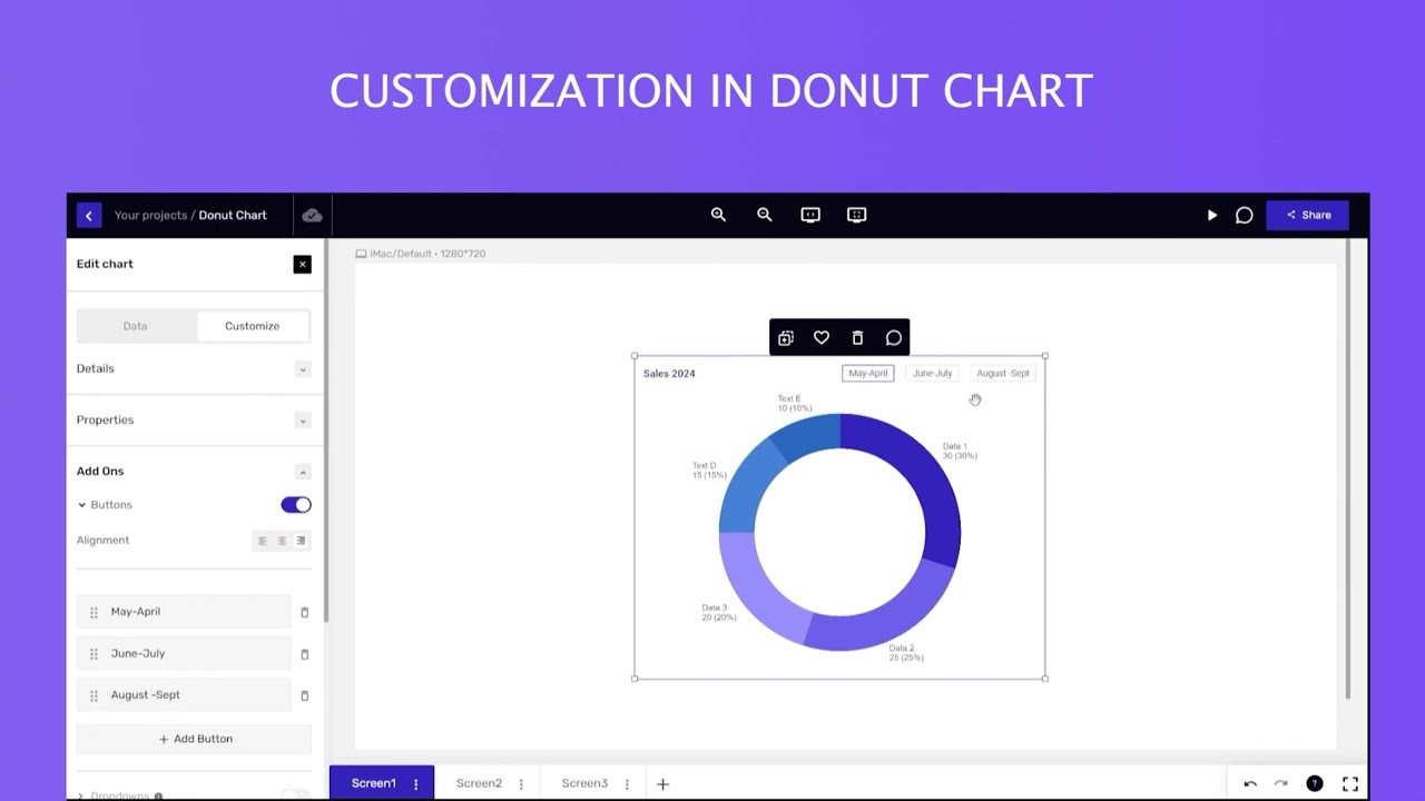
Mokkup allows various customization options for all elements. These customization options are present in the menu on the left side. The edit options are broken into 2 sections - Data and Customize.
This video will give you a full walk-through of how to edit and customize Donut Charts on app.mokkup.ai
Повторяем попытку...
Доступные форматы для скачивания:
Скачать видео
-
Информация по загрузке: