Which Font Makes the Best ⌶-Beam?
Автор: Atomic Frontier
Загружено: 2025-04-10
Просмотров: 716607
Описание:
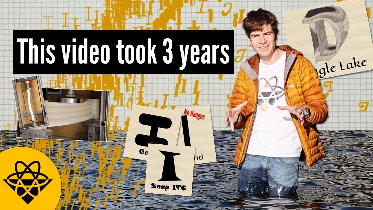
I spent three years trying to find out which typeface's capital "I" makes the best I-beam. Along the way I learned how fonts came to be and why I beams look the way they do.
Huge thanks to Coby, Hayami, Kerri, and the teams at the MIT Hobby Shop and MakerWorkshop.
Have a go with the code at: https://github.com/AtomicFrontierCode...
Or read the paper (pre-print) at: http://dx.doi.org/10.13140/RG.2.2.354...
0:00 Abstract
0:40 Literature Review
2:15 The mechanics of I-Beams
4:28 Mechanical methods
5:50 Breaking Beams
7:10 Finite element maddness
9:41 Alphabet soup
11:59 Conclusions and Practical Implications
--------- II ---------
This video was brought to you by an unhealthy amount of coffee and our awesome Patrons at / atomicfrontier .
--------- II ---------
Hi, I'm James. I explore the world looking for interesting engineering stories which explore complex issues in interesting ways. I hold a First-Class Honors in Mechanical Engineering from the University of Western Australia and am currently studying a Masters of Space Systems Engineering at the Massachusetts Institute of Technology.
My website is https://www.atomicfrontieronline.com and you can join the Atomic Frontier Discord server to talk about cool engineering stuff at / discord . You can help support my work and see some cool behind-the-scenes content at / atomicfrontier .
Повторяем попытку...

Доступные форматы для скачивания:
Скачать видео
-
Информация по загрузке:


