Dynamically ON OFF Chart Date Label In Excel
Автор: ExBiSheets
Загружено: 2023-11-16
Просмотров: 4532
Описание:
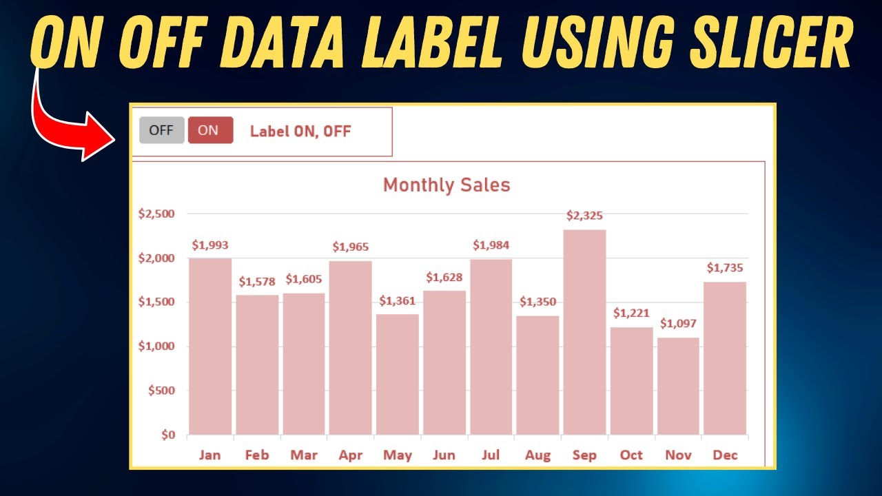
In the dynamic world of data visualization, effective chart presentation is crucial for conveying insights clearly and concisely. Among the various elements that enhance chart comprehension, data labels play a pivotal role in highlighting specific data points. However, excessive or irrelevant data labels can clutter the chart, obscuring the overall picture.
This video delves into the art of dynamically controlling data label visibility using slicers in Excel. By mastering this technique, you'll gain the power to selectively display data labels based on user interaction, ensuring a cleaner and more focused presentation.
====Chapters====
0:00 Introduction to Chart
0:18 Step 1 about data
0:22 Small Table for Slicer
1:05 Subtotal funtion
1:53 Inserting New column with Data Label formula
3:15 Formatting Chart
Throughout this comprehensive guide, you'll embark on a journey to:
Understand the role of data labels in chart interpretation
Explore the limitations of static data label display
Harness the power of slicers to dynamically toggle data label visibility
Create interactive charts that adapt to user preferences
Unveil advanced customization options for enhanced data label presentation
Whether you're a seasoned Excel expert or a budding data visualization enthusiast, this video will equip you with the skills to create insightful and interactive charts that truly resonate with your audience. So, grab your Excel workbook and prepare to elevate your data visualization prowess to new heights.
Key Points:
• Dynamically control data label visibility using slicers
• Enhance data label clarity and focus
• Create interactive charts that adapt to user preferences
• Unleash advanced customization options for data label presentation
Target Audience:
• Excel users who want to enhance their data visualization skills
• Business analysts who need to create clear and concise charts for presentations
• Data enthusiasts who want to explore advanced Excel techniques
Additional Resources:
• Microsoft Excel Documentation on Data Labels
• Excel Slicers Tutorial
• Interactive Data Visualization Techniques
Call to Action:
• Subscribe to the channel for more Excel tutorials and data visualization tips.
• Share your thoughts and experiences in the comments section below.
• Utilize the learned techniques to create engaging data visualizations for your next project.
Повторяем попытку...
Доступные форматы для скачивания:
Скачать видео
-
Информация по загрузке: