PYTHON: HOW TO CREATE HISTOGRAM| DATA VISULATION| IMAGE ANALYSIS| MATPLOTLIB PLOTTING|
Автор: DESI ASTRO
Загружено: 2024-01-24
Просмотров: 194
Описание:
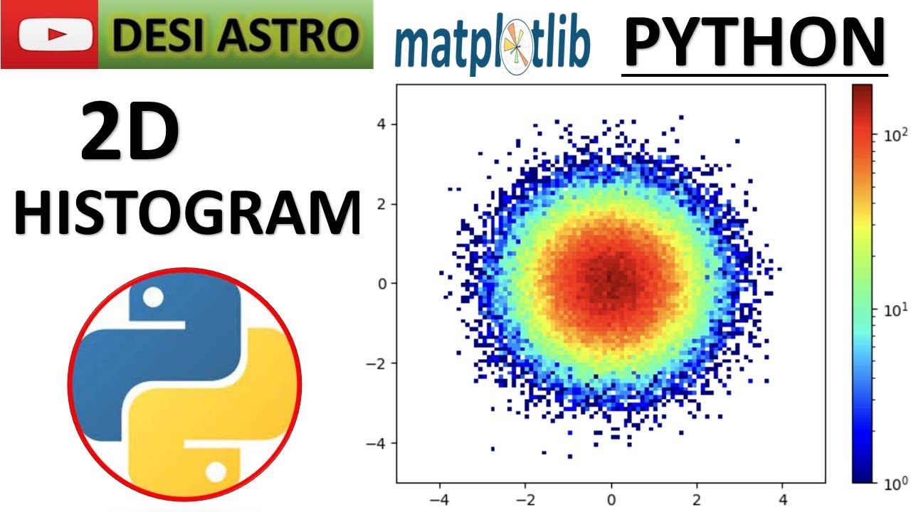
A 2D histogram is important in data science for several reasons, primarily because it provides a powerful visual representation of the relationship between two continuous variables. Here are some key reasons why 2D histograms are valuable in data science:
Visualization of Bivariate Data:
2D histograms allow data scientists to visualize the joint distribution of two variables simultaneously. This is crucial for understanding the relationship between two continuous variables and identifying patterns, trends, and correlations in the data.
Identifying Patterns and Trends:
By representing data points in a two-dimensional space, a 2D histogram can reveal patterns and trends that may not be apparent when examining each variable independently. It helps in identifying areas of high density and exploring the structure of the data.
Correlation Analysis:
Data scientists often use 2D histograms to assess the correlation between two variables. The shape and orientation of the bins in the histogram can provide insights into the strength and direction of the relationship between the variables.
Density Estimation:
2D histograms serve as a tool for estimating the density of data points across different regions of the variable space. This is particularly useful when dealing with large datasets, as it helps in identifying areas with high or low concentrations of data.
Heatmap Representation:
The color mapping in a 2D histogram can be used to create a heatmap, providing an intuitive and visually appealing way to represent the density of data points in different regions. Heatmaps are widely used in data science for quick and effective data exploration.
Outlier Detection:
Unusual patterns or outliers in the data may become more apparent when examining a 2D histogram. Deviations from the expected distribution can be easily spotted, aiding in the detection of anomalies in the dataset.
Decision Support:
In various machine learning and statistical modeling tasks, understanding the joint distribution of two variables is essential for making informed decisions. 2D histograms provide a clear representation of the underlying data structure, aiding in feature engineering and model interpretation.
In summary, 2D histograms are a valuable tool in data science for visually exploring relationships between two continuous variables, identifying patterns, assessing correlations, and gaining a deeper understanding of the structure within datasets. They contribute to the overall data exploration and analysis process, providing insights that can inform subsequent modeling and decision-making steps.
Welcome to another exciting tutorial on data visualization! In this video, we'll dive deep into the world of 2D histogram plotting using Python's powerful Matplotlib library. Whether you're a beginner looking to enhance your data visualization skills or an experienced data scientist wanting to explore advanced techniques, this tutorial is for you!
📊 What You'll Learn:
Unlocking the Power of Data: A Comprehensive Guide to 2D Histograms in Python Matplotlib"
"From Basics to Mastery: 2D Histogram Plotting with Matplotlib Explained"
"Data Visualization Magic: Mastering 2D Histograms in Python"
"Step-by-Step Tutorial: Creating Stunning 2D Histograms with Matplotlib"
"Beyond Bar Charts: Exploring Data Relationships with 2D Histograms in Python"
"Colorful Insights: Customizing 2D Histograms with Matplotlib"
"Enhance Your Data Stories: Tips and Tricks for 2D Histogram Plotting in Python"
"Data Science Aesthetics: Designing Informative 2D Histograms with Matplotlib"
"Go Beyond the Basics: Advanced Techniques in 2D Histogram Plotting"
"Visualizing Complexity: Overlaying Data on 2D Histograms in Python Matplotlib"
"Data Interpretation Made Easy: Mastering Color Scales in 2D Histograms"
"Python Data Visualization: Unraveling Patterns with 2D Histograms in Matplotlib"
"Practical Guide to 2D Histograms: Hands-On Examples and Applications"
"Efficient Data Communication: 2D Histograms for Effective Storytelling"
"Demystifying Matplotlib: A Deep Dive into 2D Histogram Plotting"
#PythonPlotting
#Matplotlib
#DataViz
#DataVisualization
#PythonCharts
#PlottingInPython
#DataScience
#CodingTutorial
#MatplotlibTutorial
#Programming
#PythonTutorial
#Visualizations
#TechTutorial
#CodeLearn
#PythonTips
#CodingCommunity
#TechExplained
#ProgrammingTips
#DataAnalysis
#LearnToCode
#PythonProgramming
#PythonCode
#PythonDevelopment
#PythonCommunity
#PythonLearning
#PythonSkills
#ProgrammingInPython
#PythonScripts
#PythonScripting
#PythonForDataScience
#PythonDevelopers
#PythonProjects
#CodeInPython
#PythonTipsAndTricks
#PythonTutorials
#PythonEducation
#Pythonic
#PythonLovers
#Pythonistas
#PythonBeginner
Повторяем попытку...
Доступные форматы для скачивания:
Скачать видео
-
Информация по загрузке: