How Color Scales Make Your Excel Reports More Insightful
Автор: Reza Mirjahan
Загружено: 2026-01-26
Просмотров: 8
Описание:
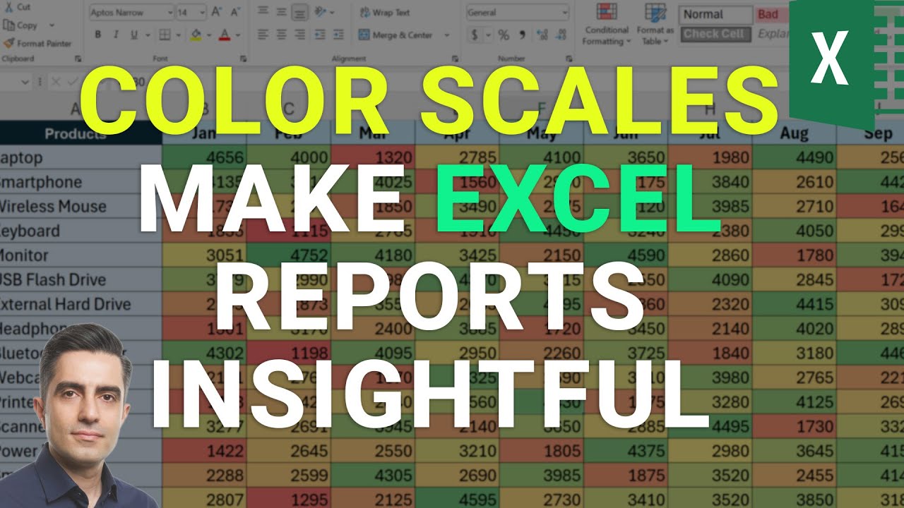
Color scales turn plain numbers into instant visual insight. Instead of reading every value, you can see patterns, highs, lows, and trends through color intensity. In this video, you’ll learn how color scales work, how to apply them correctly, and how to customize them so your data actually makes sense at a glance.
We start by applying basic color scales, then break down how Excel decides which colors go where. You’ll see why three-color and two-color scales behave differently, when one works better than the other, and how changing the rule can dramatically improve clarity.
You’ll also learn an important best practice: where color scales shine and where they can hurt readability. Finally, we dive into advanced control—manually defining minimums, midpoints, and maximums—so the colors reflect your logic, not just automatic calculations.
00:00 – What Color Scales Are & How They Work
00:26 – Applying Your First Color Scale
00:43 – Two-Color vs Three-Color Scales
01:07 – Understanding the Color Gradient Logic
01:48 – Switching to a Different Color Scale
02:20 – When Color Scales Work Best
03:10 – Customizing Min, Midpoint & Max Values
04:07 – Sorting Data to Read Color Scales Clearly
04:43 – Clearing Rules & Resetting the Sheet
Повторяем попытку...
Доступные форматы для скачивания:
Скачать видео
-
Информация по загрузке:


