'Into the Blue' A Magic Dome Pour Using Only 2 Colors! / Fluid Art / Acrylic Pouring Tutorial
Автор: Nate Bright Art
Загружено: 2022-01-30
Просмотров: 7290
Описание:
Thank you for stopping by my channel - I hope you enjoy this video! Don't forget to give me a THUMBS UP and SUBSCRIBE if you'd like to see more. Thanks again for watching - leave me a comment before you go!
Here are my Keys to Success for the Magic Dome Pour:
1. One of the great things about this kind of pour for beginners is that consistency is not as important. If you want cells and clearly defined colors and lines, your mixed paints should be on the thicker side - it should leave a trace when drizzled off of your stir stick and should leave a mound on a mound. If you want more blending of colors and fewer cells, the consistency should be a little thinner, still leaving a small mound but disappearing quickly.
2. Let your paints sit for several hours before using them to reduce the amount of air bubbles when you pour. As a general rule, the thicker the consistency of your paints, the longer it takes for the bubbles to rise through the paint and release. For thicker consistency paints, I let them sit (covered) for about 24 hours before using them. For thinner (dutch Pour) consistency, I let them sit for at least 6 hours.
3. If you're using a transparent color as a base, make sure you pre-paint the sides of the canvas. The paint layer on the sides gets very very thin because gravity forces most of it to drip off. The white canvas will show through a transparent color if you don't cover it first.
4. I used half of a large Christmas ornament to pour over. But anything that's half-round would work. A bowl or a cup... it needs to be flat on one side but round on the pouring surface.
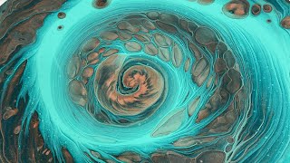
5. To get those amazing fingerlings and layered lines, I did a straight pour on the down slope of my painting tool. Pouring on the top creates an interesting effect, but different.
6. To get that spiral effect, use a spinner and move it slowly as you pour. This takes a bit of concentration, but it's not as difficult as you might think. Pour with your dominant hand and spin with the other.
7. Using the base coat color as one of the colors in your pour is a great way to ensure you have negative space. It creates an interesting illusion of pulling the negative space into the composition.
8. Don't remove your dome (or orb? bowl, cup, whatever) right away. Let the paints sit and settle. You'll get more and better natural cells this way, and it will allow the air bubbles created from pouring it onto the canvas to rise and pop.
9. When tilting, move your paint slowly in a circle and spread out your design as much as possible before going over any edges. This allows you to choose the parts you like best and choose which parts to tilt off.
10. To cover the rest of the canvas, choose a corner and tilt that direction. Once you've covered that corner, bring the weight of the paint back to the center, and then choose another direction. This is an important step - don't get impatient and skip it.
11. Remember to scrape the drips off of the underside of your canvas edges and corners. These drips can continue pulling paint off of the top of your canvas and change your composition. Scraping off the drips breaks the surface tension and stops the 'pull' of the paint in that direction.
Colors Used:
Amsterdam Phthalo Blue
Amsterdam Titanium White
My pouring medium is equal parts Floetrol, PVA glue, and gloss varnish.
My paints are mixed 2 parts pouring medium to 1 part paint, and then I add small amounts of distilled water until I reach the desired consistency if necessary.
Thanks again for stopping by - I hope to see you here again soon!
www.instagram.com/N8_Bright_Art
Повторяем попытку...

Доступные форматы для скачивания:
Скачать видео
-
Информация по загрузке: