How to Create Stunning Charts in Excel for Visual Impact
Автор: Drews Office
Загружено: 2024-06-23
Просмотров: 544
Описание:
ABOUT THIS VIDEO
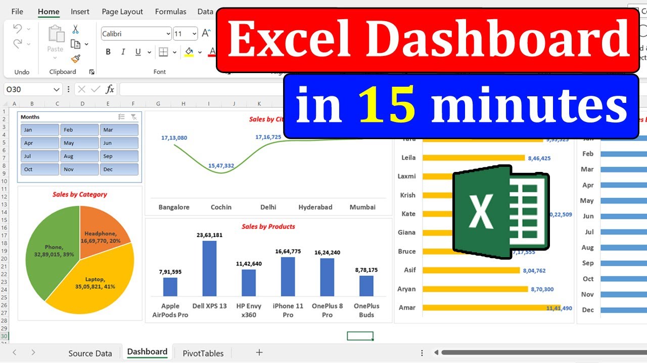
Dive into the world of data aesthetics with our latest tutorial! Learn the secrets to creating stunning charts in Excel that captivate your audience and convey information effortlessly.
In this video, we'll guide you through step-by-step processes to transform your data into visually striking charts. From choosing the right chart type to incorporating vibrant colours and customising elements, you'll master the art of data visualisation.
CHAPTERS
00:00 CHART Selection
01:00 DATA Formatting
02:50 Advanced Customisation
03:50 Visual Narratives
LIVE ONLINE TRAINING
Drew Ennis brings his enthusiastic delivery of Microsoft 365 for beginners.
Do you need 1:1 training to help you upskill?
For more information go to our website.
WEBSITE: http://www.drewsoffice.com
#excelbeginners #exceltutorial #exceltips
Повторяем попытку...

Доступные форматы для скачивания:
Скачать видео
-
Информация по загрузке: