ycliper

Популярное

Музыка Кино и Анимация Автомобили Животные Спорт Путешествия Игры Юмор

Интересные видео

2025 Сериалы Трейлеры Новости Как сделать Видеоуроки Diy своими руками

Топ запросов

смотреть а4 schoolboy runaway турецкий сериал смотреть мультфильмы эдисон
Скачать

Significance of Optical Illusion, Optical Correction, and... | Sreekumar Vivekanandan | ATypI 2020

Автор: ATypI

Загружено: 2021-03-21

Просмотров: 449

Описание: Significance of Optical Illusion, Optical Correction, and Visual Balance in Calligraphy and Font Design

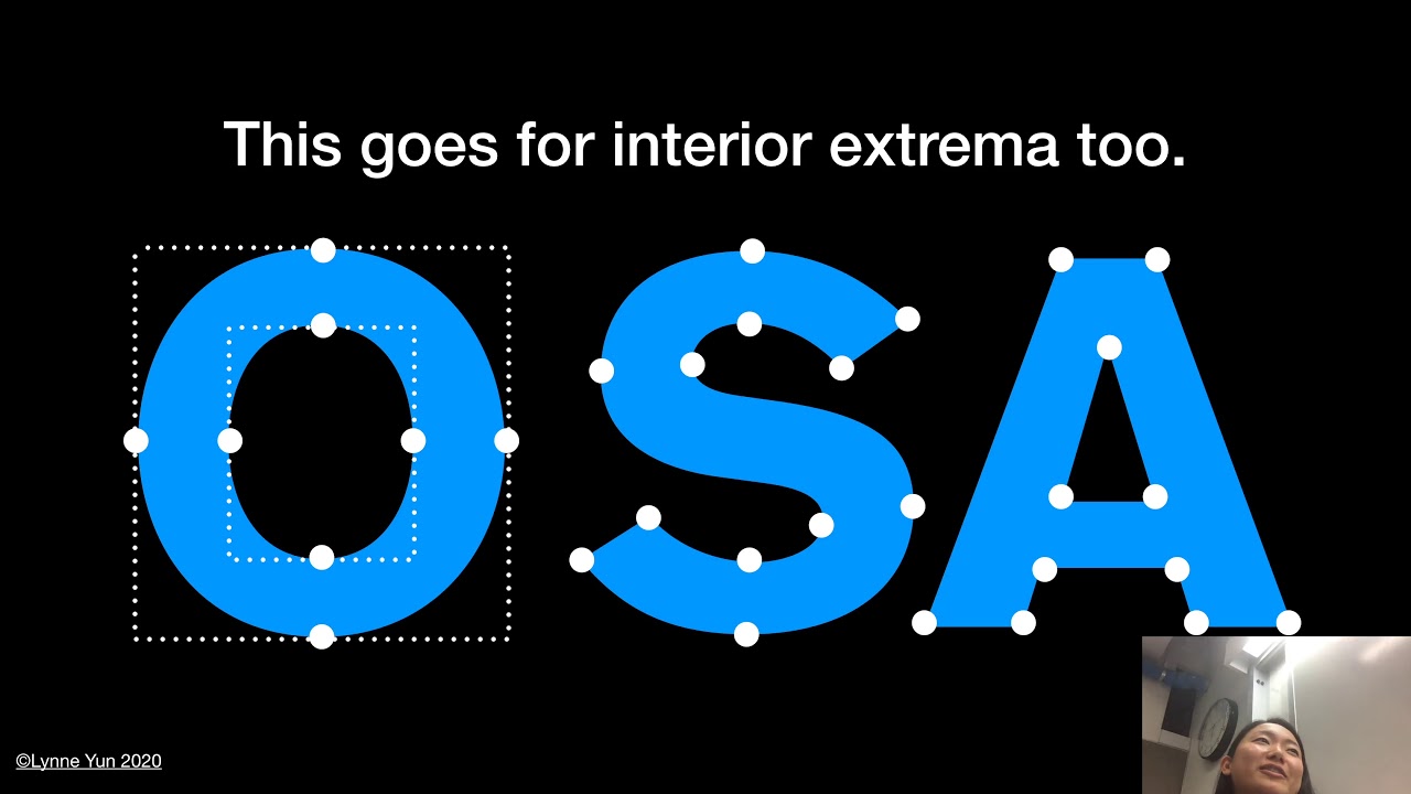
This presentation discusses various methods used by calligraphers and font designers to address visual imbalances caused by optical illusions. In visual language, there is a drastic difference between mathematical values and visual values. For example, the mathematical center and visual center of a defined geometric space are different. In many letterforms, overlapping strokes have to be optically corrected to achieve visual balance.

The ascending loop of lowercase ‘h’ in calligraphy is a good example of how calligraphers adjust the overlapping strokes in such a way to create an illusion of visual balance and harmony. This strange phenomenon exists in calligraphy, in many letterforms like lowercase letters ‘b’, ‘d’, ‘f’, ‘g’, ‘h’, ‘k’, ‘l’, ‘m’, ‘n’, ‘u’, and so on. If we look carefully at how calligraphers write ‘m’, ‘n’, and ‘u’, we can observe a seemingly unintentional method of adjusting their overlapping strokes to achieve legibility in the letterforms with similar structures like ‘n’ and ‘u.’

These fine adjustments of moving a diagonal or angular stroke upward or downward deliberately when it overlaps a vertical or horizontal is a deliberate, conscious, and well-planned activity to tackle the problems caused by optical illusions. They are adjusted by font designers also, irrespective of the language of the font.

There are several occasions where a font designer has to consciously deviate from the mathematical grid created by the designers themselves, to achieve uniformity among all glyphs in a font. For example, the upper curve of the letter ‘O’ in upper case, as well as lower case, has to be adjusted so that it protrudes above the respective horizontal and mathematical grid line. The letter ‘X’ has a long list of optical corrections to be done in font design.

Presentation by G.V. Sreekumar followed by Q&A led by moderator Crystian Cruz.

***
G.V. Sreekumar is a professor and former head of IDC School of Design, IIT Bombay. He specializes in typography, calligraphy, publication design, information graphics, design pedagogy, and visual semantics. He studied Applied Art at M.S. University, Baroda, and Visual Communication at IDC, IIT Bombay. Under the guidance of renowned typographer and calligrapher R.K. Joshi, Sreekumar has designed some of the most renowned magazines in India, including “CHIP,” “Digit,” “Chandamama,” “Overdrive,” “Society,” “Savvy,” and “Banking Frontiers.”

Не удается загрузить Youtube-плеер. Проверьте блокировку Youtube в вашей сети.
Повторяем попытку...
Significance of Optical Illusion, Optical Correction, and... | Sreekumar Vivekanandan | ATypI 2020

Поделиться в:

Доступные форматы для скачивания:

Скачать видео

  • Информация по загрузке:

Скачать аудио

Похожие видео

An Oasis of Type: Type Design of the People | Ishan Khosla | ATypI 2020 All Over

An Oasis of Type: Type Design of the People | Ishan Khosla | ATypI 2020 All Over

Typeface Legibility and Low-vision Readers | Sofie Beier | ATypI 2023 Paris

Typeface Legibility and Low-vision Readers | Sofie Beier | ATypI 2023 Paris

Font Ergonomics—A new experimental paradigm using AI | Octavio Pardo Virto | ATypI Paris 2023

Font Ergonomics—A new experimental paradigm using AI | Octavio Pardo Virto | ATypI Paris 2023

Шрифты обманывают ваш мозг!

Шрифты обманывают ваш мозг!

Type Design Class Parsons Spring 2020

Type Design Class Parsons Spring 2020

Greg Gazdowicz:

Greg Gazdowicz: "Type Design"

Geometry Center Videos

Geometry Center Videos

Hyperlegible: an approach to accessible type design

Hyperlegible: an approach to accessible type design

Type Feedback Time – Improve Your Font Design

Type Feedback Time – Improve Your Font Design

Stream of Kana: Japanese Kana Drawing Performance | Hiroyuki Masuda & Keitaro Sakamoto | ATypI 2020

Stream of Kana: Japanese Kana Drawing Performance | Hiroyuki Masuda & Keitaro Sakamoto | ATypI 2020

10 лет рисовал логотипы и вот что понял

10 лет рисовал логотипы и вот что понял

Почему вопрос “что за пределами Вселенной” пугает самих физиков?

Почему вопрос “что за пределами Вселенной” пугает самих физиков?

Способ увидеть невидимое: как создаются суперлинзы из оптических метаматериалов?

Способ увидеть невидимое: как создаются суперлинзы из оптических метаматериалов?

Как я съездила на Мюнхенскую конференцию по безопасности

Как я съездила на Мюнхенскую конференцию по безопасности

Typesetting Trains | Laurence Penney | ATypI 2020 All Over

Typesetting Trains | Laurence Penney | ATypI 2020 All Over

Parsons Type Design Class Week 3 (Spring 2020)

Parsons Type Design Class Week 3 (Spring 2020)

Как освоить дизайн шрифтов за 10 шагов

Как освоить дизайн шрифтов за 10 шагов

Не узел

Не узел

Промты уже прошлое. 4 шага как обучиться работе с нейросетями за 7 дней

Промты уже прошлое. 4 шага как обучиться работе с нейросетями за 7 дней

Как распознать ложь - рассказывает агент ФБР

Как распознать ложь - рассказывает агент ФБР

© 2025 ycliper. Все права защищены.


  • Контакты
  • О нас
  • Политика конфиденциальности


Контакты для правообладателей: [email protected]