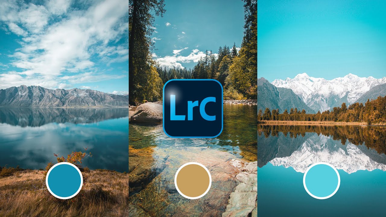
This is how you get Orange & Blue Tones in Lightroom Classic
Автор: Christian Möhrle - The Phlog Photography
Загружено: 2022-08-06
Просмотров: 11633
Описание:
Learn how to get a beautiful orange & blue color palette for your photos with Adobe Lightroom Classic
If you want to follow along this Lightroom Tutorial, you can find the raw file here:
https://drive.google.com/file/d/1XCeQ...
▬▬▬▬▬▬▬▬▬▬▬▬▬▬▬▬▬
Thank you for watching my video!
► http://www.the-phlog.com
► Patreon: / phlog
► Instagram: / thephlog
▬▬▬▬▬▬▬▬▬▬▬▬▬▬▬▬▬
0:00 Intro
I wanted the colors to be way more vibrant and intense. The landscape in the foreground already had a subtle orange tone, so I wanted to make that a lot stronger, while also giving the sky stronger blue tones. Plus, I wanted to make the sky a lot darker and reveal some more details in the clouds. All of that was done in Lightroom Classic (I used Photoshop to clean up the image though).
0: 20 1. Basic Raw Adjustments
I started by changing the profile to Adobe Landscape for more base saturation. Next, I adjusted the white balance to give me some more natural colors to begin with. I increased the highlights, the shadows and the whites to make the whole shot a bit brighter. To get some more sharpness, the texture, clarity and dehaze were raised. Finally, I increased the vibrance.
2:11 2. Masking
I started with a linear gradient over the sky. Here, I dropped the exposure, added contrast and a lot of clarity. This made the top portion much darker and added a lot more detail for the clouds. I added one morel inear gradient on the sky with more clarity and contrast plus I dropped the temperature slightly giving the sky more blue tones. On the horizon level to the right I added a radial gradient and brought down the highlights to prevent overexposure. Also, I increased the blacks and dropped the dehaze for some glow. Finally, I used the brush mask to select the foreground. Here, I increased contrast, highlights, whites, texture and clarity to make the area more interesting.
5:19 3. Color Grading
First, I brought down the purple hue to reduce purple tones in the sky. Next, I dropped the orange saturation very slightly, while increasing the blue saturation. In the luminance tab, I increased the orange tones (making the foreground brighter) and dropped the blue tones (darkening the sky). For the split toning, I added a warm color to the highlights and the mid-tones with very low saturation. For the shadows I used a blue color.
Повторяем попытку...

Доступные форматы для скачивания:
Скачать видео
-
Информация по загрузке: