Скачать
Excel Column Charts Explained Compare Data Easily
Автор: Daniel Githua Tutor
Загружено: 2026-01-11
Просмотров: 8
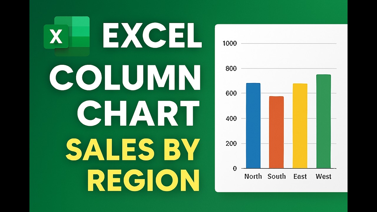
Описание: Column charts are one of the most popular ways to compare categories in Excel. In this tutorial, you’ll learn how to create a column chart step‑by‑step using regional sales data. I’ll show you how to format axes, add labels, customize colors, and highlight differences across regions. By the end, you’ll know exactly when to use column charts and how to make them presentation‑ready. #excel #tutorial #education #microsoft #columnchart #exceltricks #exceltips
Не удается загрузить Youtube-плеер. Проверьте блокировку Youtube в вашей сети.
Повторяем попытку...
Повторяем попытку...
Доступные форматы для скачивания:
Скачать видео
-
Информация по загрузке:


![How To Create a Pie Chart In Microsoft Excel [2026 Guide]](https://image.4k-video.ru/id-video/9MkQYUNm8HI)