Excel 3D SURFACE CHART Explained Fast
Автор: Excel Artista
Загружено: 2026-01-26
Просмотров: 55
Описание:
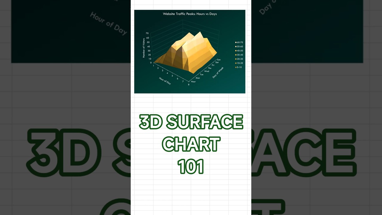
Learn when to use 3D surface charts in Excel and how to build them in under 60 seconds. This tutorial shows you how to visualize three-variable relationships with continuous data across two dimensions using elevation and color gradients that reveal peaks, valleys, and patterns. Perfect for Excel users who want to master advanced 3D visualization for scientific data, terrain modeling, and multi-dimensional analysis.
Best for: peaks and valleys across two dimensions; heatmap-style patterns with a 3D surface.
✅ Pros: shows high/low regions at a glance; works well with gridded (matrix) data.
❌ Cons: 3D perspective can mislead; occlusion can hide details behind ridges.
How to create: Select your matrix → Insert → Surface or Radar → 3-D Surface.
Sample data used: Website traffic by Hour (rows) and Day (columns); peaks around Thu–Fri afternoons (~60–70 visitors).
Styling tip: rotate to a readable angle; consider Contour/Color Scale alternative; label axes clearly; avoid exaggerated depth; keep a single color gradient.
Perfect for: traffic heatmaps, performance across time vs day, geography grids, simulation outputs.
Excel 3D surface chart,
how to create 3D surface chart in Excel,
best chart for peaks and valleys,
surface vs heatmap/contour chart,
Excel chart tutorial,
chart pros and cons
#Excel #Charts #SurfaceChart #3DChart #DataViz #Spreadsheet #ExcelTips #Dashboard #Analytics #shorts
Повторяем попытку...
Доступные форматы для скачивания:
Скачать видео
-
Информация по загрузке:


