Let me help you narrow things down! 🎨
Автор: Doris Rose Art
Загружено: 2024-08-28
Просмотров: 12854
Описание:
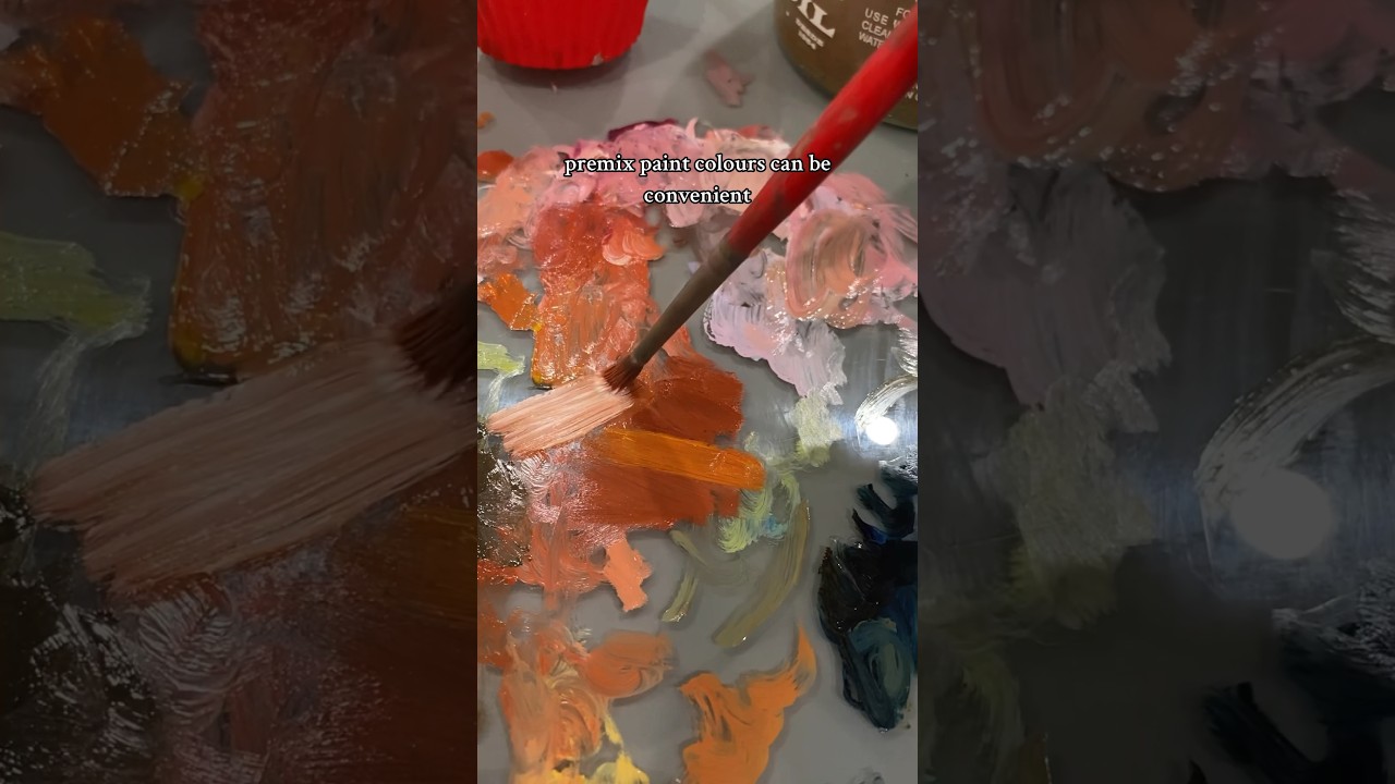
Are you pro convenience colours?
Have you ever gone to the art store, been overwhelmed by choice and just picked the colours that you liked? I think every artist has been there! But as a professional artist here’s a little tip… next time, check the paint tube label to see how many pigments have been used in that colour. You’ll be able to tell based on how many pigment codes are on the label.
Pigment codes start with P for pigment, then another letter, for example R for red, Y for yellow, or Br for brown, & then a number corresponding to the exact pigment in that family. So an example pigment code is PW6 (titanium white). A great resource to look up pigment codes is artiscreation.com.
In general it’s best to pick paint colours that only include one pigment. Obviously there are many reasons why you might pick a convenience colour (pre-mixed pigments). For example you mix certain paints a lot, you’re replicating a discontinued or toxic colour, or you want a consistent mix of a certain colour. But single pigment colours are almost always better as you can always mix paint with other colours, but you can’t un-mix a multi pigment colour to make it more pure & chromatic.
An example of this is buying phthalo blue rather than primary cyan. Most colours called primary cyan are Phthalo blue pre-mixed with white. You can mix primary cyan yourself but you can’t un-mix a store bought cyan back to a deeper, richer, more transparent phthalo.
Pre-mixed blends might be convenient, but they can also be limiting & if you’re trying to narrow down which colours to buy focussing on single pigments is a great way to do it!!
Follow me for more art tips & please consider buying me a ☕️ to help support videos like this (link in bio)!!
Повторяем попытку...
Доступные форматы для скачивания:
Скачать видео
-
Информация по загрузке: