Excel Dynamic HR DASHBOARD - Part 5 MAKE CHARTS AND GRAPHS
Автор: Excel at the Office
Загружено: 2024-05-17
Просмотров: 1132
Описание:
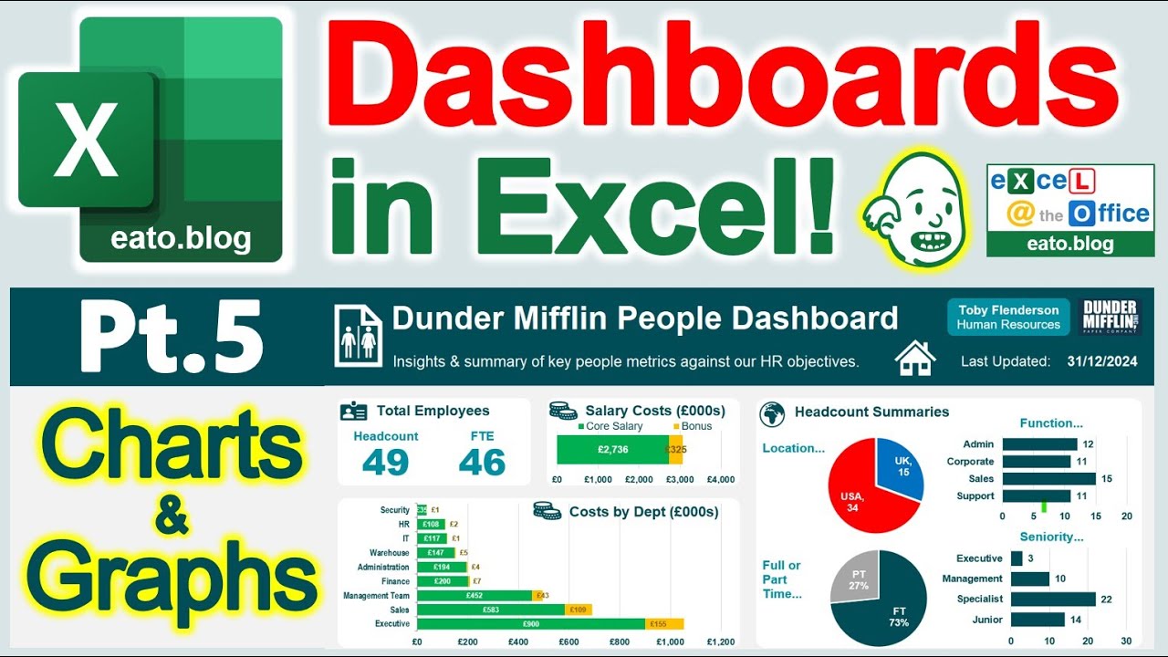
In PART 5 of how to create a dashboard in Excel, we'll now create all the nice charts and graphs which represent your data to the viewer. I show you how to create a mix of smart text boxes, pie charts, bar charts, donut charts, and stacked bars. Plus there's loads of workflow tips along the way as usual, including a quick hack to copy chart formats to new charts!
It's a long-ish video but this stuff takes time to do right and be assured you can learn dashboards within a morning in this series. You can check out the chapters to skip to particular content of interest.
For this Excel dashboard, I've used an HR dataset from the fictional company 'Dunder Mifflin', which you may know from 'The Office' TV show. I believe it's good to use familiar and fun data while learning, rather than the generic or bland 'dummy data' used in such tutorials. I find it more engaging and the concepts seem to flow easier.
Download the follow-along dataset should you wish to learn by creating this exact thing from my blog below. But using the concepts and learning, you'll be able to create your own dashboard from ANY dataset!
https://excelattheoffice.com/2024/04/...
This is video 5 in my mini-series all about how to make stunning and dynamic dashboards of charts and graphs in Excel. Video 1 gave you an introduction and demo of the HR dashboard I've created. In Video 2 I showed you how to set up the worksheets and refine the data with formatting and calculations. Video 3 went deep on creating the pivot tables to summarise the raw data. In Video 4 we created the dashboard canvas. Stay tuned for the finale in this mini-series, where we'll use slicers to make this dynamic and put on the finishing touches!
____________________________
Chapters
0:00 - Intro, overview of steps
2:12 - Helpful hints summary
4:30 - Use text boxes for totals, format
7:50 - Salary costs, stacked bar in detail
13:45 - 2x Pie chart graphics with labels
19:52 - 2x Simple bar charts & formats
25:10 - Costs by dept stacked bar
28:40 - Another text box infographic
30:08 - Donut chart & bespoke legend key
33:40 - Top 5 bar chart graphic, formatting
35:50 - Complaints by dept donut chart
40:05 - Percentage pie chart
42:02 - Diversity graphics stacked bars
46:20 - Length of service bar charts (pointers)
47:12 - Salary gap column chart overview
48:46 - Monthly birthdays column chart
51:05 - Recap, close and outro
_________________
I hope you find this helpful. Let me know your thoughts and questions in the comments. See my other videos or blogs with more tips:
https://excelattheoffice.com/blog
Kind Regards,
Adrian
Повторяем попытку...
Доступные форматы для скачивания:
Скачать видео
-
Информация по загрузке: