ycliper

Популярное

Музыка Кино и Анимация Автомобили Животные Спорт Путешествия Игры Юмор

Интересные видео

2025 Сериалы Трейлеры Новости Как сделать Видеоуроки Diy своими руками

Топ запросов

смотреть а4 schoolboy runaway турецкий сериал смотреть мультфильмы эдисон
Скачать

Power BI BAR CHART: PBI MasterClass!!!

Автор: Power BI Bro

Загружено: 2023-12-08

Просмотров: 3912

Описание: Power BI BAR CHART a PBI MasterClass!!!! Elevate your data visualization skills to pro-level status with our comprehensive tutorial on mastering bar charts in Power BI. In this guide, we provide a step-by-step walkthrough to simplify and stylize your data using bar charts. Learn essential techniques to effectively communicate your insights, from adjusting colors and labels to optimizing layout and formatting. With practical examples and expert tips, you'll gain the confidence to create professional-quality bar charts that make a lasting impact. Whether you're a novice or an experienced user, this tutorial equips you with the knowledge and skills to transform your data visualization workflow and impress your audience with visually appealing bar charts in Power BI. Join us on this educational journey to become a master of bar charts and simplify your data visualization like a pro!

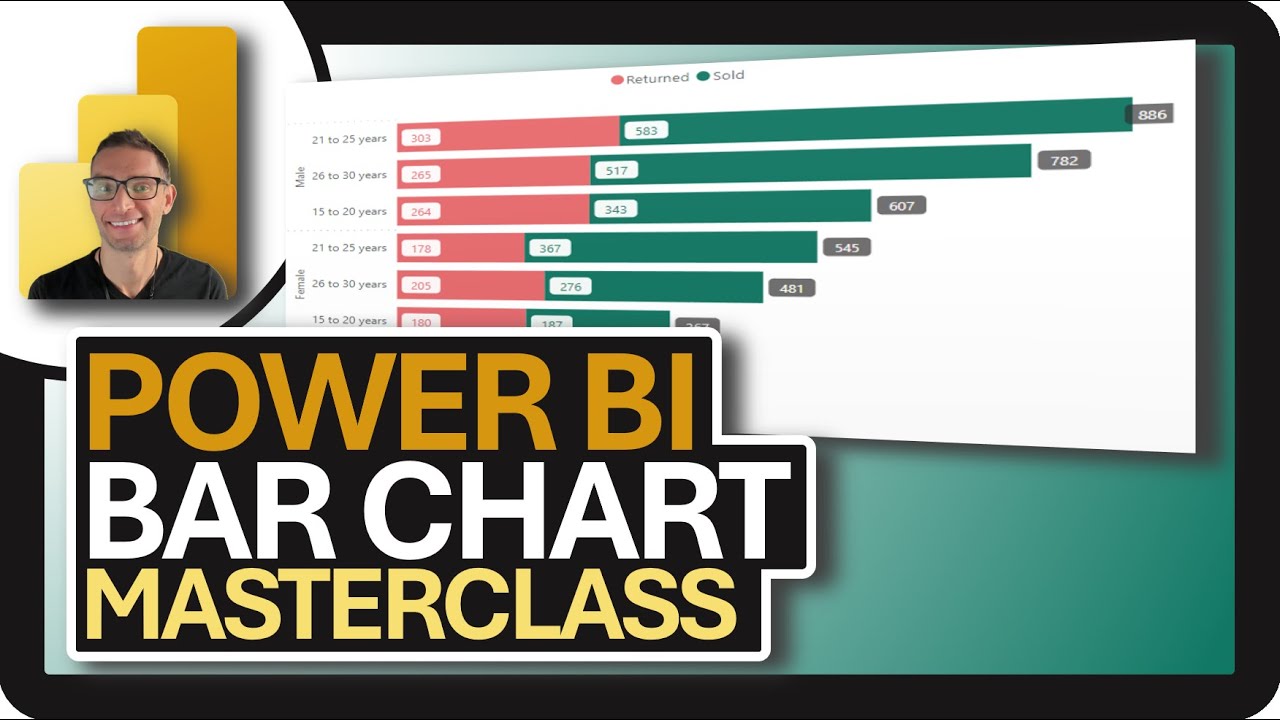
In this Power BI bar chart tutorial formatting masterclass, I will explain how to fully master formatting and designing the bar chart power bi visual.

You might be wondering, what formatting options are there with the power bi bar chart? Don't worry, I will show you everything you need to know to unlock all of the formatting secrets of the Power BI bar chart. This tutorial will educate and inform the advanced power bi dashboard developer as well as be a power bi tutorial for beginners.

Follow along using the same file!
https://github.com/powerbibro/powerbibro

Timestamps:
0:00 - Introduction
1:29 - Telling A Story
5:18 - Values & Hierarchy
8:30 - Intentional Color
10:30 - Declutter Axis and Title
16:10 - Labels
22:50 - Holistic Experience

Learn how to create and format a powerful bar chart in Power BI with this masterclass tutorial! Unlock the secrets of formatting and take your data visualizations to the next level. Whether you're a beginner or an experienced user, this tutorial will help you maximize the potential of your bar charts in Power BI. Watch now and become a bar chart pro in no time!

#powerbi #powerbidesktop #powerbibro #powerbitutorial
#datavisualization #dataanalytics #businessintelligence #microsoftfabric #dax

Не удается загрузить Youtube-плеер. Проверьте блокировку Youtube в вашей сети.
Повторяем попытку...
Power BI BAR CHART: PBI MasterClass!!!

Поделиться в:

Доступные форматы для скачивания:

Скачать видео

  • Информация по загрузке:

Скачать аудио

Похожие видео

Power BI Dynamic SCATTERPLOTS: PBI MasterClass!!!

Power BI Dynamic SCATTERPLOTS: PBI MasterClass!!!

Power BI Easy PARETO CHART!! 📊 (NEW July 2025 Feature!!)

Power BI Easy PARETO CHART!! 📊 (NEW July 2025 Feature!!)

ОСВОЕНИЕ столбчатых диаграмм в Power BI | Больше никаких вырезаемых меток

ОСВОЕНИЕ столбчатых диаграмм в Power BI | Больше никаких вырезаемых меток

LEVEL UP your BAR CHARTS in Power BI by CREATING THIS ^

LEVEL UP your BAR CHARTS in Power BI by CREATING THIS ^

Creating Shape Map in Power BI Using Native charts | Time-Lapse video

Creating Shape Map in Power BI Using Native charts | Time-Lapse video

Data Visualization

Data Visualization

Краткий обзор Power BI 2025 🔥 Важные обновления, о которых вам нужно знать

Краткий обзор Power BI 2025 🔥 Важные обновления, о которых вам нужно знать

Power BI Tutorials

Power BI Tutorials

Power BI DONUT и PIE Chart: мастер-класс PBI!!!

Power BI DONUT и PIE Chart: мастер-класс PBI!!!

Power BI Bar Charts: From A - Z  in 1 Hour | Step by Step Tutorial

Power BI Bar Charts: From A - Z in 1 Hour | Step by Step Tutorial

Как отобразить перекрывающиеся столбчатые диаграммы в Power BI // Показать и сравнить дисперсию

Как отобразить перекрывающиеся столбчатые диаграммы в Power BI // Показать и сравнить дисперсию

Bar chart makeover in Power BI

Bar chart makeover in Power BI

Excel против Power BI против SQL против Python | Сравнение на фондовом рынке

Excel против Power BI против SQL против Python | Сравнение на фондовом рынке

Включить ДОПОЛНИТЕЛЬНЫЕ ПАРАМЕТРЫ цвета I Динамический градиент в Power BI

Включить ДОПОЛНИТЕЛЬНЫЕ ПАРАМЕТРЫ цвета I Динамический градиент в Power BI

Ditch the Gauge Charts! Build Modern UX/UI Designed Progress Bars in Power BI (Full Tutorial)

Ditch the Gauge Charts! Build Modern UX/UI Designed Progress Bars in Power BI (Full Tutorial)

Get MORE out of Your BAR CHARTS in Power BI

Get MORE out of Your BAR CHARTS in Power BI

🎯 Power BI Expanding Bar Charts: Plug Record Masterclass!! 🔌📊

🎯 Power BI Expanding Bar Charts: Plug Record Masterclass!! 🔌📊

Create Diverging Bar Charts in Excel & Power BI | Bipolar Bar Chart Full Tutorial

Create Diverging Bar Charts in Excel & Power BI | Bipolar Bar Chart Full Tutorial

Интеграция Claude + Power BI 🧠 ОГРОМНЫЙ прорыв благодаря MCP 💥 (обновление за ноябрь 2025 г.)

Интеграция Claude + Power BI 🧠 ОГРОМНЫЙ прорыв благодаря MCP 💥 (обновление за ноябрь 2025 г.)

Как использовать Claude для создания БЕЗУМНЫХ финансовых моделей (2026)

Как использовать Claude для создания БЕЗУМНЫХ финансовых моделей (2026)

© 2025 ycliper. Все права защищены.


  • Контакты
  • О нас
  • Политика конфиденциальности


Контакты для правообладателей: [email protected]