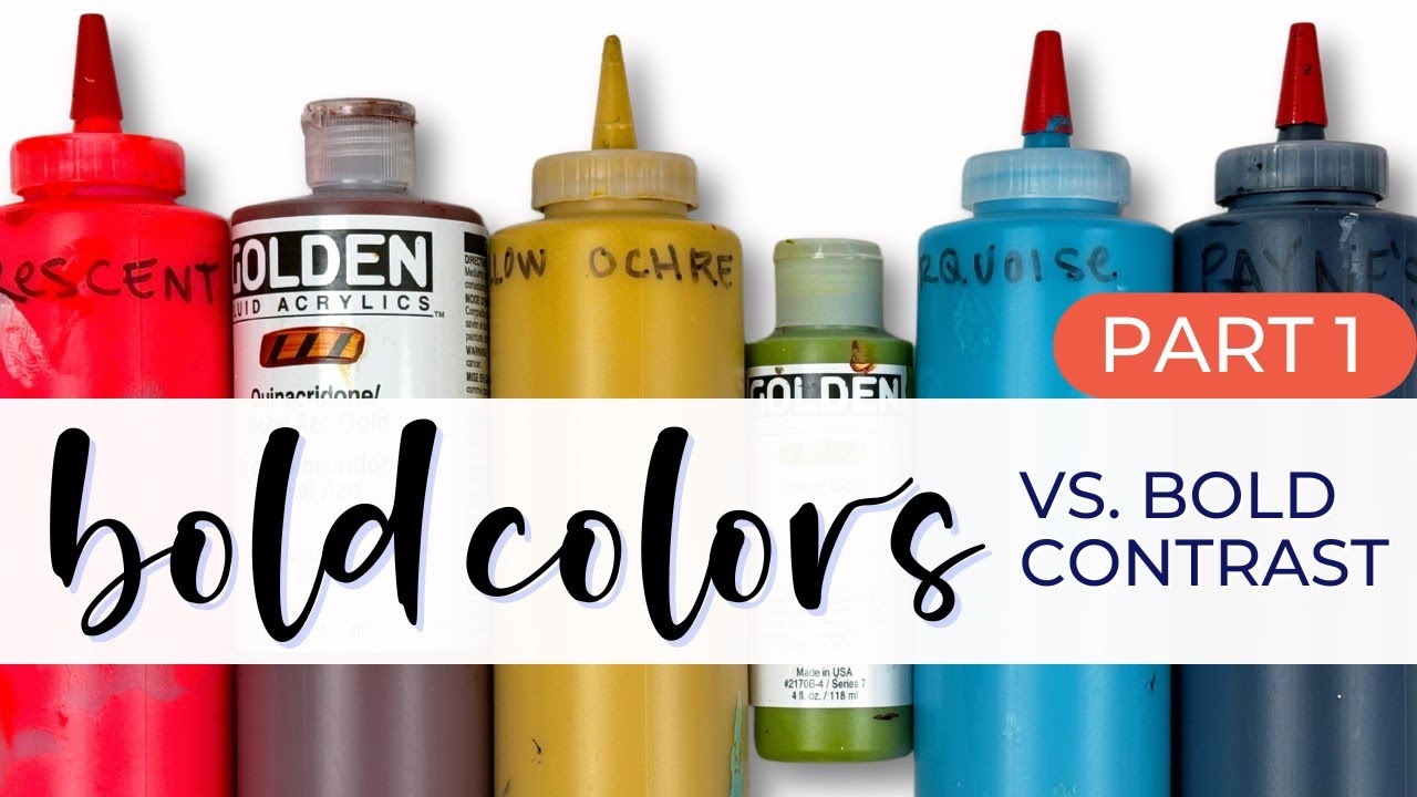
Bold Colors vs. Bold Contrast - Part 1: Saturated color + Neutral
Автор: Jackie Schomburg-Abstract Art & Creative Wellness
Загружено: 2024-10-27
Просмотров: 3986
Описание:
In this video (Part 1 of 2), I'm specifically focused on transforming a blank page into an explosion of bright, fully-saturated, low contrast colors, then adding neutrals.
Part 2 ( • Bold Colors vs. Bold Contrast - Part 2: Hi... ), begins where Part 1 ends. Join me as I completely transform the pages into a pair of sophisticated, high-contrast abstract paintings.
Materials used:
Canson Mixed Media Sketchbook: https://amzn.to/3pxu4sI
Acrylic Paint: Nova Color Paints & Golden Paints
China Markers: https://amzn.to/4f5qtXu
Color shaper: https://amzn.to/3NEflnE
Click to subscribe for more tutorials just like this: / @jackieschomburgart
Comments, questions, and shares are always welcome and appreciated!
Follow me for more tutorials, paintings, and behind-the-scenes footage from inside my studio:
Instagram: www.instagram.com/jackieschomburgart
Facebook: www.facebook.com/jackieschomburgart
Share this video: • Bold Colors vs. Bold Contrast - Part 1: Sa...
Повторяем попытку...
Доступные форматы для скачивания:
Скачать видео
-
Информация по загрузке: