Methods: Impressive UI & Clever Psychological Design Trick | App Breakdown #48
Автор: App Breakdown
Загружено: 2026-02-26
Просмотров: 559
Описание:
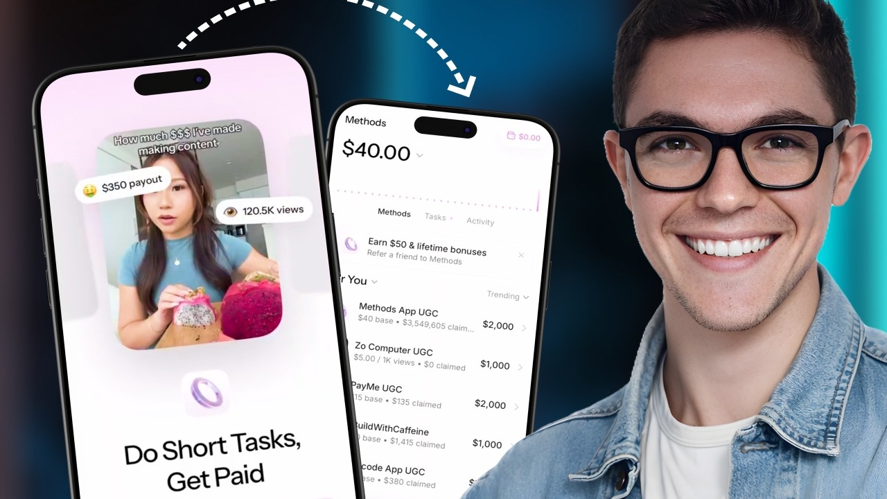
Methods wants to pay you to make UGC content, and whether or not it delivers on that promise, its UI design is some of the most polished we've seen in the series.
From a pre-login carousel that shows you exactly what you'll earn before you commit, to a phone number ask reframed as "save your progress," to sheets that morph seamlessly between one another, the Methods team made smart, deliberate choices at almost every step.
This episode covers the full flow — onboarding, home screen, brand profiles, wallet, library, chat, and the creation pipeline — and pulls out the specific design decisions worth stealing (and the ones to avoid).
Timestamps:
00:00 - Intro: What Methods is and the App Breakdown milestone
00:45 - First impression: pre-login carousel and copy
01:22 - Onboarding: goal-setting, revenue slider, posting schedule
03:10 - "Where did you hear about us?"
04:01 - The benchmark screen: making more with Methods vs. other platforms
05:34 - Skip flows, the $40 never-zero trick, and saving progress
06:07 - Best-in-class notification prompt design
07:23 - Home screen: clean layout, wallet, and daily task nudges
09:21 - Brand profiles: scripts, payout tiers, and applying to campaigns
11:17 - The broken swipe animation between companies
12:22 - Library: resources, scripts, and the no-camera creation approach
13:40 - Chat UX: great aesthetics, critical panel dismiss bug
16:59 - Final verdict
Methods on App Store Tracker: https://www.appstoretracker.com/app/m...
Повторяем попытку...
Доступные форматы для скачивания:
Скачать видео
-
Информация по загрузке:


![[LIVE] Ada Wong Cosplay and Resident Evil Requiem!](https://imager.clipsaver.ru/0iPbleFOtuM/max.jpg)