ycliper

Популярное

Музыка Кино и Анимация Автомобили Животные Спорт Путешествия Игры Юмор

Интересные видео

2025 Сериалы Трейлеры Новости Как сделать Видеоуроки Diy своими руками

Топ запросов

смотреть а4 schoolboy runaway турецкий сериал смотреть мультфильмы эдисон
Скачать

37 Qlik Sense Gauge Chart | Qlik Sense Tutorial for Beginners

Автор: Abhishek Agarrwal

Загружено: 2019-01-14

Просмотров: 9676

Описание: 
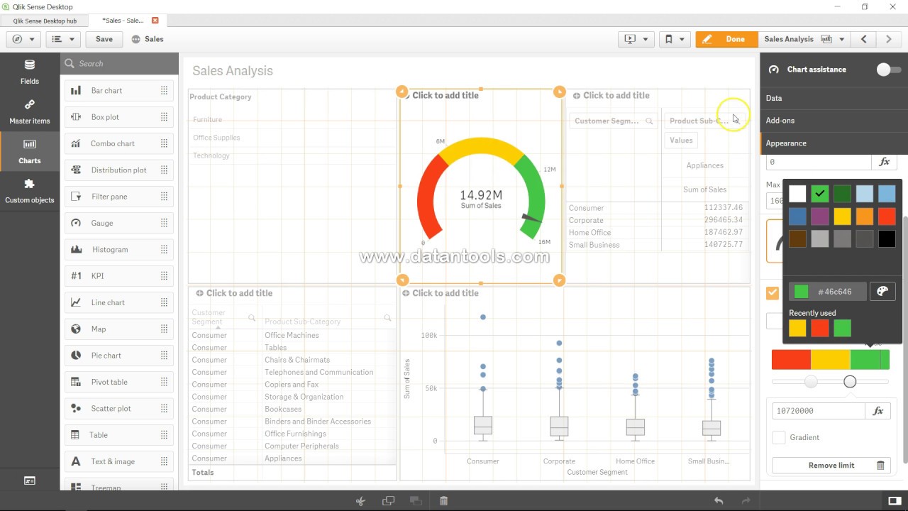
In this #qliksense video tutorial video I hvae talked about how you can create gauge chart in qliksense. Gauge is like a car's speedometer which tells how you are doing right now based on the selection you have applied in qliksense.

#QlikSenseTutorial

The gauge is designed to show a single measure value and visualize how to interpret that value.

When to use it
The gauge is often used to present KPIs, for example, on an executive dashboard, and together with segmenting and color coding, it is an effective way of illustrating a performance result.

It is important to set relevant max and min values to support the interpretation of the value. You can use a reference line to provide additional context.

Advantages
A gauge is easy to read and understand and gives an instant indication of the performance within an area.

Disadvantages
The gauge is quite space-demanding in relation to the single value it visualizes.

Although visually compelling, the gauge is not always the best choice for presenting a single measure value. Problems when deciding the max and min values can indicate that some other visualization should be used.

If you only want to show a performance value, without a gauge, consider using a KPI instead.

Creating a gauge
You can create a gauge on the sheet you are editing. In a gauge you can only have one measure and no dimensions.

Do the following:

From the assets panel, drag an empty gauge to the sheet.
Click Add measure and select a measure or create a measure from a field.
When you have created the gauge, you may want to adjust its appearance and other settings in the properties panel.

The following settings are used by default in a gauge:

A radial gauge.
A single (blue) color.
Range limits: min (0), max (100).
No segments.
Label and title are displayed in medium scale.

Display limitations
When a measure value is outside the range limits, an arrow indicates whether the measure value is higher or lower than the range values.

Не удается загрузить Youtube-плеер. Проверьте блокировку Youtube в вашей сети.
Повторяем попытку...
37 Qlik Sense Gauge Chart | Qlik Sense Tutorial for Beginners

Поделиться в:

Доступные форматы для скачивания:

Скачать видео

  • Информация по загрузке:

Скачать аудио

Похожие видео

38 Qlik Sense Histogram Chart

38 Qlik Sense Histogram Chart

Почему Ядерная война уже началась (А вы не заметили)

Почему Ядерная война уже началась (А вы не заметили)

Qlik Sense Tutorial: 3.5 Hours of Beginner to Advanced Qlik Sense Training

Qlik Sense Tutorial: 3.5 Hours of Beginner to Advanced Qlik Sense Training

QlikSense Complete Tutorial

QlikSense Complete Tutorial

Сравнительный анализ в Qlik Sense с использованием альтернативных состояний

Сравнительный анализ в Qlik Sense с использованием альтернативных состояний

Qlik Sense Basic Tutorial for Beginners [2024] - Complete Tutorial - Getting Started - Part 1

Qlik Sense Basic Tutorial for Beginners [2024] - Complete Tutorial - Getting Started - Part 1

Музыка для работы за компьютером | Фоновая музыка для концентрации и продуктивности

Музыка для работы за компьютером | Фоновая музыка для концентрации и продуктивности

КАК Япония Незаметно СТАЛА Мировой Станкостроительной ДЕРЖАВОЙ!

КАК Япония Незаметно СТАЛА Мировой Станкостроительной ДЕРЖАВОЙ!

Abstract Black and White wave pattern| Height Map Footage| 3 hours Topographic 4k  Background

Abstract Black and White wave pattern| Height Map Footage| 3 hours Topographic 4k Background

Qlik Sense Tutorial Gauge Chart

Qlik Sense Tutorial Gauge Chart

Box Plot chart

Box Plot chart

Qlik Sense Basic Tutorial for Beginners [2024] - Complete Tutorial - Getting Started - Part 2

Qlik Sense Basic Tutorial for Beginners [2024] - Complete Tutorial - Getting Started - Part 2

Как использовать диаграммы и графики Qlik Sense

Как использовать диаграммы и графики Qlik Sense

Qlik Sense Recipes: Comparing Values of the Same Chart | packtpub.com

Qlik Sense Recipes: Comparing Values of the Same Chart | packtpub.com

Используйте кнопки для динамического изменения мер и измерений

Используйте кнопки для динамического изменения мер и измерений

Создайте ПОТРЯСАЮЩУЮ панель инструментов Tableau всего за 10 минут

Создайте ПОТРЯСАЮЩУЮ панель инструментов Tableau всего за 10 минут

Qlik Maps Point layer Complete Guide

Qlik Maps Point layer Complete Guide

Маркированная диаграмма в Qliksense #qlikcloud #qliksaas

Маркированная диаграмма в Qliksense #qlikcloud #qliksaas

Qlik Sense Dashboard Magic: HOW to create SPARKLINES  in QLIK Sense

Qlik Sense Dashboard Magic: HOW to create SPARKLINES in QLIK Sense

Explore and Learn Link Table Concept in #qliksense to Handle Multiple Fact Tables in Data Model.

Explore and Learn Link Table Concept in #qliksense to Handle Multiple Fact Tables in Data Model.

© 2025 ycliper. Все права защищены.


  • Контакты
  • О нас
  • Политика конфиденциальности


Контакты для правообладателей: [email protected]