Marta Guidotti: The pursuit of reading comfort
Автор: Typography Theory Practice
Загружено: 2025-12-15
Просмотров: 26
Описание:
Watch all presentations at www.typographytheorypractice.xyz
Marta holds MAs in Visual Arts (2020, Accademia di Belle Arti di Firenze) and Graphic Design (2021, PXLMAD School of Arts, Hasselt). Her internship at READSEARCH ignited her passion for design research, focusing on typography, language, and cultural diversity. Since 2022, she has been a FWO-funded Ph.D. student at READSEARCH, researching how language diversity impacts legibility, under Ann Bessemans, within the Rhythm & Reading Comfort track. In 2022, her Master project The Visual Identity of a Language earned a TDC Certificate of Typographic Excellence and was featured in Tokyo TDC Vol. 33: The Best in International Typography and Design.
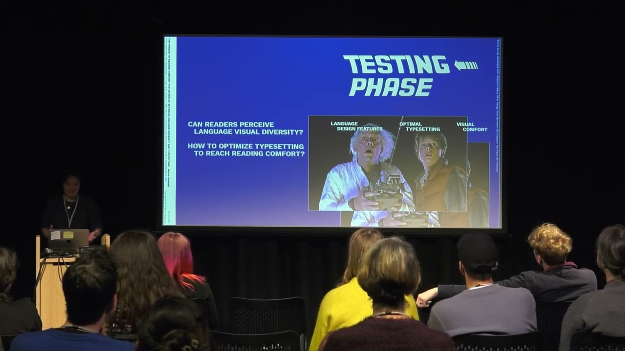
This paper delves into the intersection between language diversity and reading comfort, measured as typographic rhythm. There are many different languages using the Latin script and each language has its unique way to define the text-pattern. Language-specific letter frequencies and combina1ons create different patterns, so called rhythms, on the page. These rhythms, manifested as abstract black and white stripe patterns formed by typographic elements (letters) and their surrounding spaces, fundamentally shape our reading experience. Building on Unger’s (2006) belief that these rhythms give a solid base when reading, we explore how these language determined visual rhythms affect legibility, particularly in terms of visual comfort, a crucial aspect tied to the spatial frequency of the text’s inherent stripe pattern (1). Periodic patterns such as those formed by the black and white stripes within letters, words and lines of text can induce visual discomfort (2). As well, spacing, i.e. the ratio between black and white elements, is important to counterbalance language design features and to obtain a comfortable pattern/rhythm. By examining 72 languages, we identified 34 typographic design features that define variations in text patterns. For example, diacritics, ascenders and descenders change the blackness in the space between the text lines, while long or short words define the amount of words and spaces in the text line. Through empirical research we are testing, with experienced readers, from different linguistic background and any significant visual impairment, how these features impact reading comfort, challenging the current standard conventions that layout programs (Word, InDesign) give as default, e.g. the 120% line-spacing to type-size proportion that is kept regardless the language of the text, ignoring its specific visual and spatial features. This leads to a re-evaluation of typesetting (letters, words, lines-spacing) in relation to language-specific design features, to achieve better reading material and increase reading comfort.
1. Bessemans, Ann. 2012. “Letterontwerp voor kinderen met een visuele func@ebeperking”. Leiden University
Bessemans, Ann 2025. The automatization of rhythm deduction in type [Automatic Type Design 3]
Conlon, Elizabeth G. 1993. “A Model of Visual Discomfort and Its Implications for Efficient Reading Performance,”. University of Wollongong
O’Hare, L., & Hibbard, P. B. 2011. Spatial frequency and visual discomfort. Vision Research, 51(15), 1767–1777
Penacchio, Olivier, and Arnold J. Wilkins. “Visual Discomfort and the Spatial Distribution of Fourier Energy.” Vision Research 108 (March 2015): 1–7.
Wilkins, Arnold J. 1995. Visual Stress. Oxford University Press: London
Wilkins, Arnold, Katie Smith, and Olivier Penacchio. 2020. “The Influence of Typography on Algorithms That Predict the Speed and Comfort of Reading.”
Vision 4, no. 1 (March 12, 2020)
2. Bessemans, Ann. 2015. Rhythm and Reading Comfort. [ATypI S.o Paulo]
Wilkins, Arnold. Nimmo-Sith, Ian. Tait, Anne. McManus, Christopher, Della Sala, Sergio. Tilley, Andrew. Arnold, Kim. Barrie, Margaret. Scott, Sydney.
1984. “A neurological basis for visual discomfort”. Brain, 107 (1984), pp. 989-1017
–
Typography Theory Practice was a one-day conference on Saturday 19 October 2024 at Leeds Beckett University, organised by Professor Fraser Muggeridge, that explored how typographic theories and propositions can manifest in practice, can be used to explain practice, and become practice. The conference brought typographic theory and practice together across a range of contexts and applications.
Повторяем попытку...
Доступные форматы для скачивания:
Скачать видео
-
Информация по загрузке:


