Make waterfall charts in Excel (the EASY way!)
Автор: storytelling with data
Загружено: 2023-11-21
Просмотров: 179711
Описание:
Join our FREE virtual mini-workshop on June 26th from 11AM-12PM ET! You'll learn key strategies as bestselling author Cole Nussbaumer Knaflic transforms graphs into an effective data story. Register here: https://www.storytellingwithdata.com/...
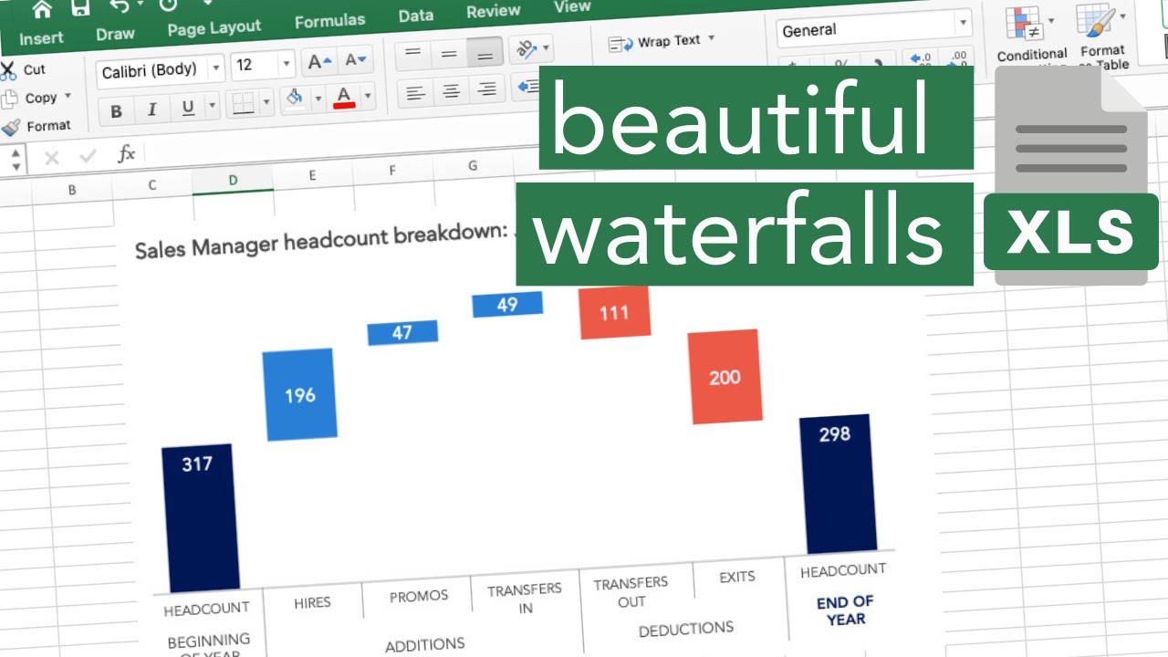
Do you want to learn how to create a beautiful waterfall chart (sometimes called a bridge chart) in Excel? This video tutorial goes step-by-step through the process.
Using the standard waterfall chart template available in Excel 2016 (and later versions) the following techniques are covered:
creating the initial waterfall
setting the beginning and end total bars
reducing visual clutter by removing chart borders, gridlines, connecting lines and redundant axes, formatting the horizontal axis, changing the bar colors
adding chart titles
formatting data labels using the number format code.
For older versions of Excel without the waterfall option, manually create the chart by manipulating the underlying data and using invisible stacked or error bars.
Waterfall charts visualize the net change between two values. Instead of just showing a beginning value in one bar and an ending value in a second bar, a waterfall chart dis-aggregates all of the unique components that contributed to that net change, and visualizes them individually.
JUMP TO THE SECTION THAT INTERESTS YOU
00:00 Intro
00:26 Waterfall chart introduction
02:06 Main tutorial - make a waterfall chart in Excel
07:20 Recap and outro
BROWSE RELATED RESOURCES
● SWD chart guide: https://www.storytellingwithdata.com/...
● Excel tutorials playlist | • Excel tutorials
● How to turn data into stories: a mini workshop | https://youtube.com/live/Hfx1X9WSGYQ
IMPROVE YOUR DATA VISUALIZATION & STORYTELLING SKILLS
INTRODUCING OUR NEW BOOK - AVAILABLE TO PREORDER
📚 STORYTELLING WITH DATA: BEFORE & AFTER
Packed with real-world makeovers and practical strategies, through twenty powerful transformations, watch ineffective charts evolve into engaging visuals that captivate, inform, and lead to smarter decisions—preorder now! https://amzn.to/3QNJtyV
STAY CONNECTED
👉 Sign up for our newsletter to be notified about new content and offerings. https://storytellingwithdata.com/news...
Повторяем попытку...
Доступные форматы для скачивания:
Скачать видео
-
Информация по загрузке:


