Line Chart Matplotlib || Lesson 3.3 || Python for Data Science || Learning Monkey ||
Автор: Learning Monkey
Загружено: 2021-08-11
Просмотров: 316
Описание:
Line Chart Matplotlib
In this class, We discuss Line Chart Matplotlib.
The reader should have prior knowledge of the bar chart. Click here.
We use the superstore data set. The data set is discussed in our previous class.
Line Chart Matplotlib
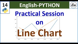
A line chart is a graphical representation used in connecting a series of data points with a continuous line.
In our data set, we use a line chart to display year-wise total sales.
With this continuous line, we will understand how sales are going in the last ten years.
To get the year-wise sale details, we use the column order date.
The column order date is of type DateTime in pandas.
We need to extract the year from the date. The methods used to extract the year from the date are discussed here.
The program to extract the year from the date and placing in a new column is given below.
df=pd.read_excel('sampledata.xls',sheet_name='Orders')
print(df.head())
df['year'] = df[;'Order Date'].dt.year
print(df.head())
grouping sales year wise
temp=pd.DataFrame(df.groupby(['year'])['Sales'].agg('sum'))
print(temp)
x=temp.index
y=temp['Sales'].values
print(x)
Simple Line Plot
To construct a line plot, we use the method plot from matplotlib.pyplot.
In the example, we use year on the x-axis and total year-wise sales on the y-axis.
The variable x contains years, and the variable y contain total sales.
We use the parameter color to give the line color.
The simple line chart code and output are shown below.
line plot code
import matplotlib.pyplot as plt
z=plt.figure(num=1,figsize=(10,5))
plt.plot(x, y, color ='blue')
plt.xticks(x)
plt.xlabel("Year")
plt.ylabel("Sum of sale")
plt.title("Year Wise Total Sale")
plt.show()
Multiple Lines
We can plot multiple lines in a graph.
We consider a total sale and furniture sale year-wise to plot multiple lines.
Below is the code to show multiple lines.
plot Multiple lines
we are taking furniture sale year wise to plot
temp1=pd.DataFrame(df.groupby(['year','Category'])['Sales'].agg('sum'))
print(temp1)
x1=temp1.index
print(x1)
temp2=temp1.xs('Furniture', level='Category')
print(temp2)
y1=temp2['Sales'].values
print(y1)
Multiple line plot code
import matplotlib.pyplot as plt
z=plt.figure(num=1,figsize=(10,5))
plt.plot(x, y, color ='blue')
plt.plot(x,y1,color='red')
plt.xticks(x)
plt.xlabel("Year")
plt.ylabel("Sum of sale")
plt.title("Year Wise Total Sale")
plt.legend(['Total','Furniture'],loc=0)
plt.show()
We notice the furniture sale line is almost flat. By looking at the output of multiple line charts
We are not having clarity about the exact sale value because the y-axis unit measure is large.
We can change the unit measure of the y-axis using yticks. We discuss how to change units in our next class.
We used the plot function multiple times to plot the line chart twice.
Line Width Parameter
We use the line width parameter to increase or decrease the line width.
The below code will increase the line width of the total sale.
Line width and line style
import matplotlib.pyplot as plt
z=plt.figure(num=1,figsize=(10,5))
plt.plot(x, y, color ='blue',linewidth=4)
plt.plot(x,y1,color='red',linestyle=':')#for dash line use --
plt.xticks(x)
plt.xlabel("Year")
plt.ylabel("Sum of sale")
plt.title("Year Wise Total Sale")
plt.legend(['Total','Furniture'],loc=0)
plt.show()
Short cuts and Markers
We can show dotted lines, dashed lines, etc.
Short cuts are used to show the line options.
Markers are used to mark the data point of our data.
Marker o is used to mark circles at the data point.
The marker s is used to mark the square at the data point.
The color, line type, and marker is shown using a shortcut in the plot method.
The below code shows the shortcuts and markers used in the plot method.
Short cuts and Markers
import matplotlib.pyplot as plt
z=plt.figure(num=1,figsize=(10,5))
plt.plot(x, y, 'b-o')
plt.plot(x,y1,'r--s')
plt.xticks(x)
plt.xlabel("Year")
plt.ylabel("Sum of sale")
plt.title("Year Wise Total Sale")
plt.legend(['Total','Furniture'],loc=0)
plt.show()
Below showing some of the markers used in python.
The reader should try these markers for better practice.
Few Marker shapes supported by matplotlib
Link for playlists:
/ @learningmonkey
Link for our website: https://learningmonkey.in
Follow us on Facebook @ / learningmonkey
Follow us on Instagram @ / learningmonkey1
Follow us on Twitter @ / _learningmonkey
Mail us @ [email protected]
Повторяем попытку...

Доступные форматы для скачивания:
Скачать видео
-
Информация по загрузке: